Remember back in the day when going to the dentist was a traumatizing experience? Oh, was that just me because I wore braces? Anyway, I remember despite my list of grievances, having to grin and bear it (no pun intended). One of the beautiful things about how times have changed is that we’re starting to see boutique dental practices that lead with an approachable patient-first experience.
In 2024, I started a weekly color post on LinkedIn where I created a new color palette (usually 4-5 colors) and invite others to discuss how it might be used and how it makes people feel. When I’m looking to creatively explore beyond our client projects, I pull a color palette from this series and go to town. For this challenge, I decided to take one of the suggestions from the LinkedIn post and run with it. This project was to design a brand identity for a boutique dental practice. Let’s go!
The Creative Process
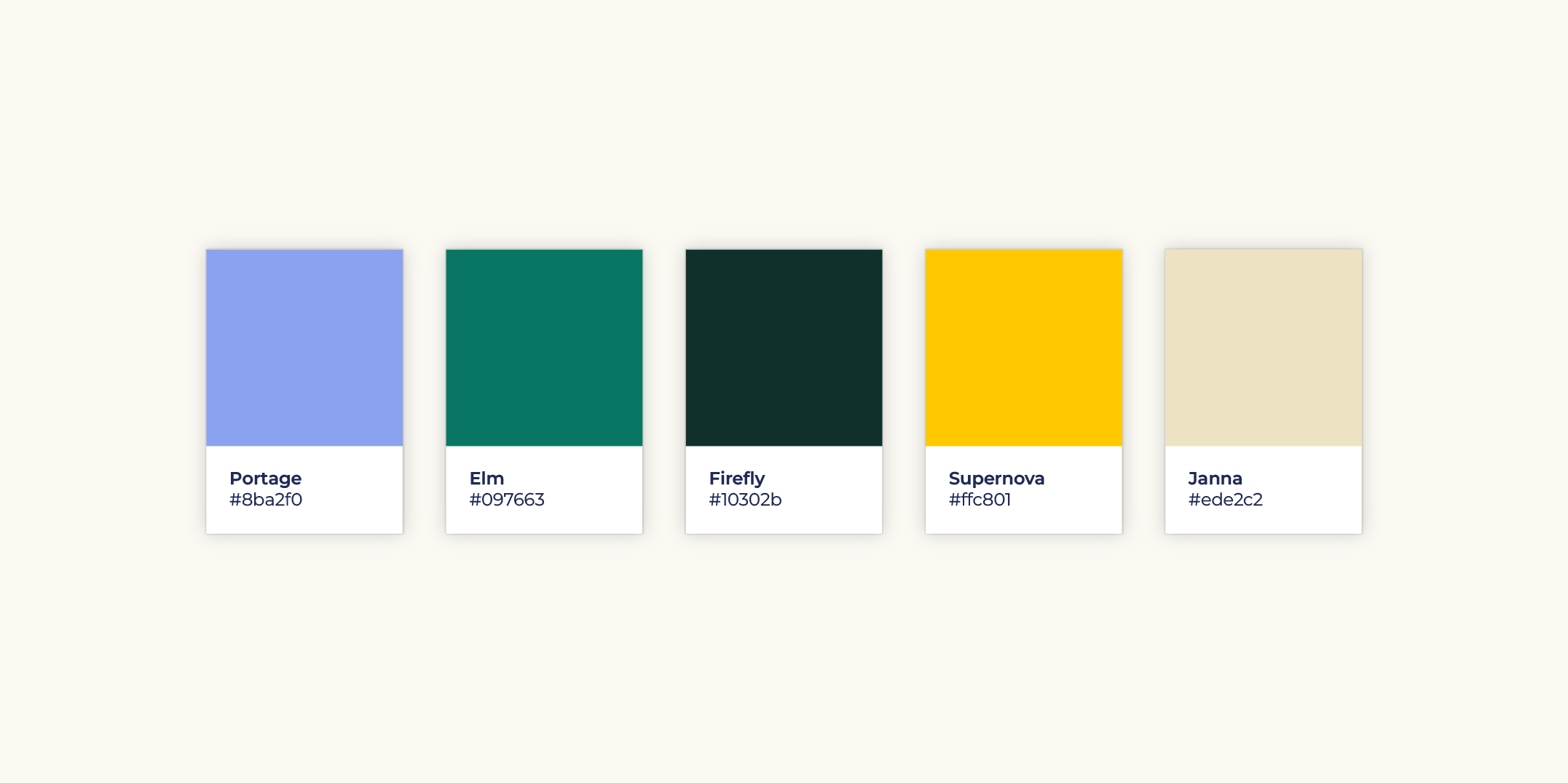
The biggest rule for this challenge is to not let it take up too much time. I stay under 5-6 hours tops from start to finish. It’s so easy to get lost in a side project and go deep. That’s why I set a time boundary. We do have other projects we’re working on, after all. Here’s the color palette I was working with. I remember being nervous about this particular color palette with it’s assortment of cooler tones. That was until I added the Supernova color, a much needed burst of light.
One of my favorite things about this little challenge is that it allows me to be playful and to go with the first idea that pops into my head. It’s a muscle I flex often because of the improv comedy work I do outside of the office. And it’s a constant reminder to not overthink it, something we all fall victim to in our adult lives in the real world. So, let’s turn this color palette into a brand for a boutique dental practice.
What’s in a Name?
It’s so easy to call a dentist office “Bright Smile” or something equally as catchy. I was hoping to get creative with the name here. One of the ways I quickly brainstorm names is to check out the translation of words in other languages. So it turns out that the word “smile” translates to “Sorriso” in Brazilian Portuguese, and “Sonrisa” in European Spanish. Amazing! Those are both great names to work with. I’m going with “Sonrisa” because it looks like “sunrise,” and if a good sunrise doesn’t make you smile, I don’t know what will.
When thinking about the name of a company, there are three major points to consider:
Memorability and Simplicity
Choose a name that is easy to spell, pronounce, and remember. A simple yet distinctive name helps ensure that people can recall and share it effortlessly.
Relevance and Brand Fit
Ensure the name aligns with your company’s mission, values, and industry. It should evoke the right emotions or associations with your target audience and clearly reflect what your business stands for or offers.
Uniqueness and Availability
Check that the name is unique to avoid confusion with competitors. Verify that domain names, social media handles, and trademarks are available to establish a consistent and legally protected brand identity.
For this little project, I didn’t do a deep dive on the competition. But I did find the name to be approachable and easy to pronounce (even if you don’t know European Spanish). That’s a win in my book.
Now it’s Time to Design
My first instinct was to create a logo that included a smile. But, that’s is an image that has been used repetitively in the industry. So I tossed that out and anything related to a tooth. Do you remember the movie Inception? A skilled thief who steals secrets through dream-sharing technology is given a chance at redemption if he can successfully plant an idea into a target’s subconscious—but the mission blurs the line between dreams and reality. One of my favorite lessons from this movie is that in order to get an idea to stick, you have to reduce it to it’s simplest form.
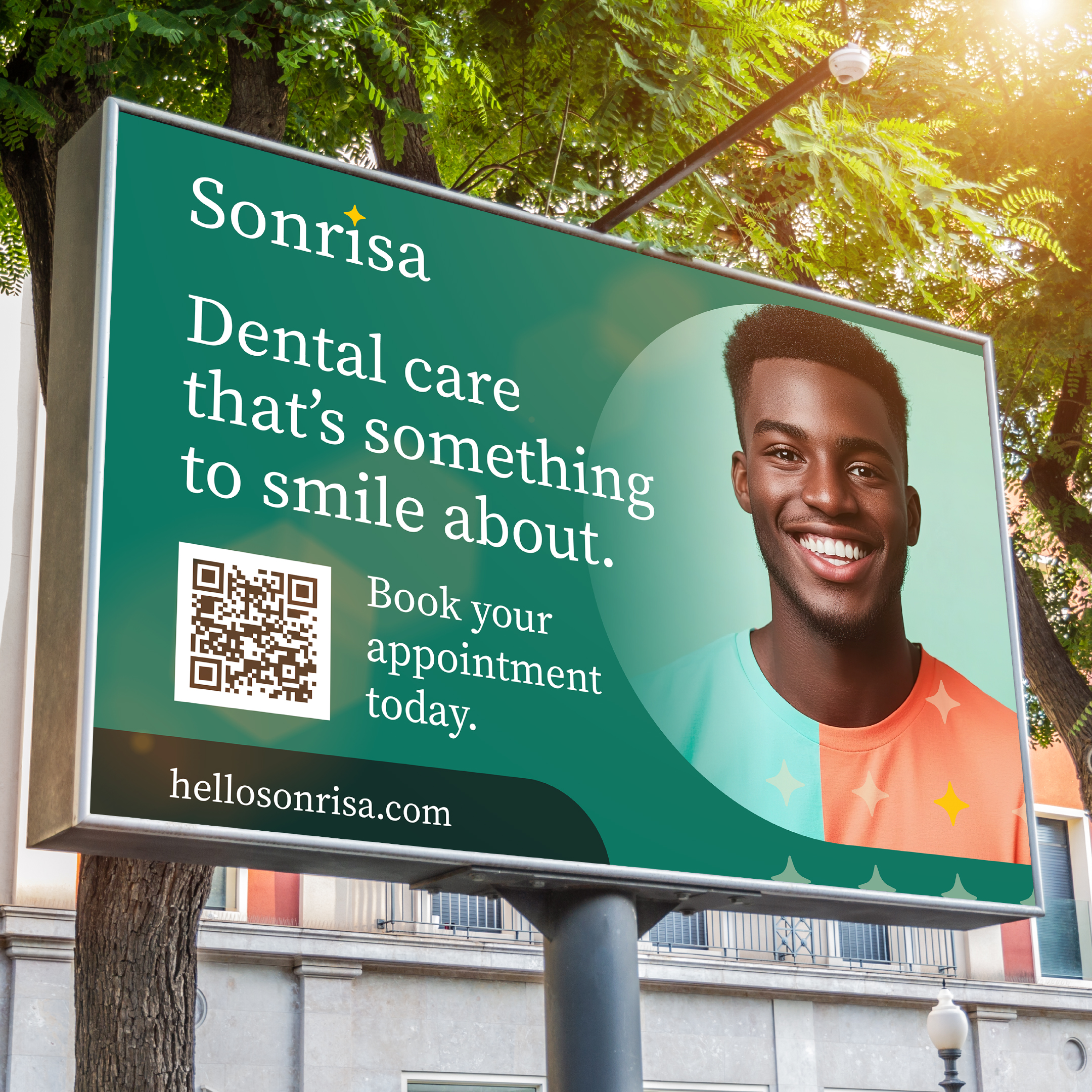
This translates easily to the way we design at Points North. We like clear direct paths for calls to action, and clean design. The same rules apply here. When it comes to logo design, less is always more. For the limited time I had to create a logo for Sonrisa, I started with a sans serif font, Source Serif, to give the brand a bit of permanence. Sonrisa plans to be around for a while. Then, I replaced the dot on the letter “i” with a spark. This is a nod back to old television commercials and movies, where someone would flash a smile so bright you could see a spark. The spark is the simplest idea of a bright, beautiful smile. Once I had this together, it was time to build out some additional design elements.
Building Out the Brand
Thinking About Action Colors
My first thought was to make the Supernova color the call-to-action color. But, the color pops more as a stand-alone accent and as part of the logo. Too much of a bold yellow can be overpowering. But just the right amount is something to appreciate. With that, I went with Portage, the periwinkle color in the palette, as the color for buttons on the website, and other accents through the brand.
Selecting the Right Photography
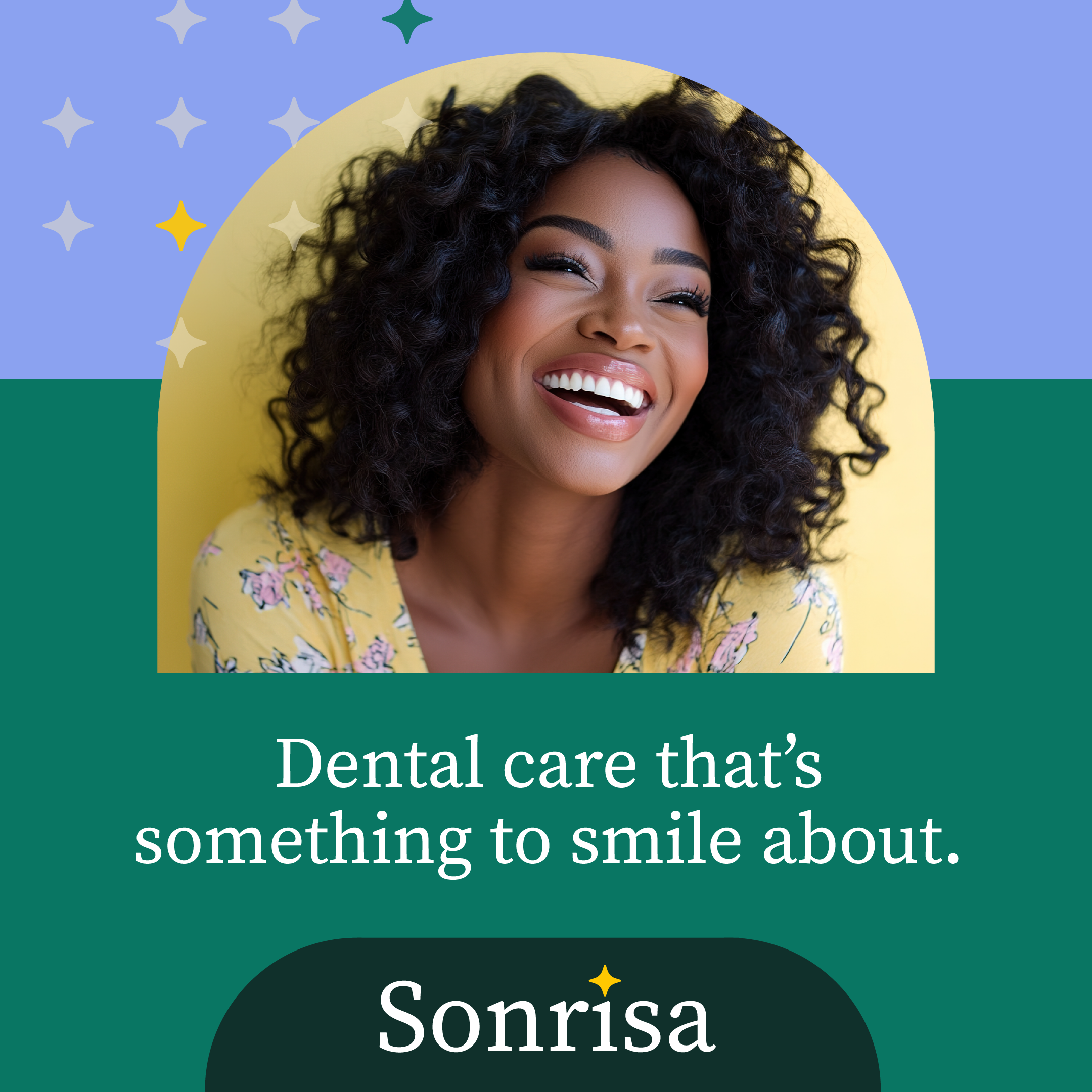
Dental care is changing, and I wanted this brand to feel approachable, so I used photographs of diverse happy smiles. The goal is to give a great option for people searching for a new dental experience and to invite people back to the dentist who haven’t been in a while (hey, no judgment here; fear gets the best of all of us sometimes).
Thinking about the Website
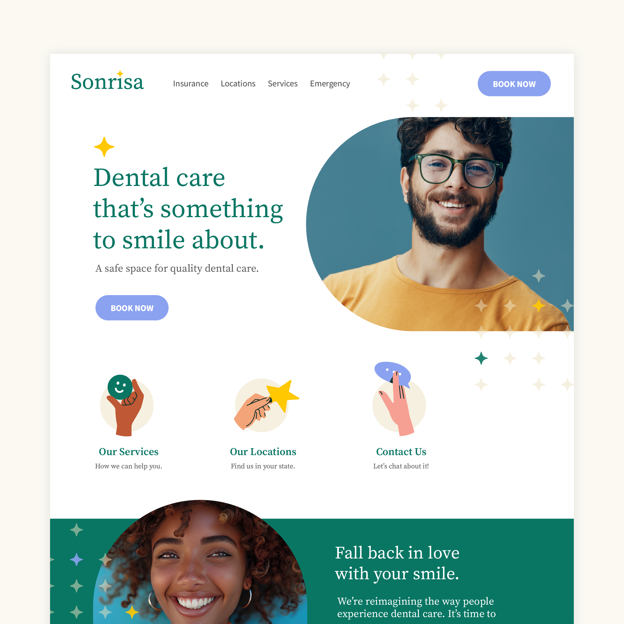
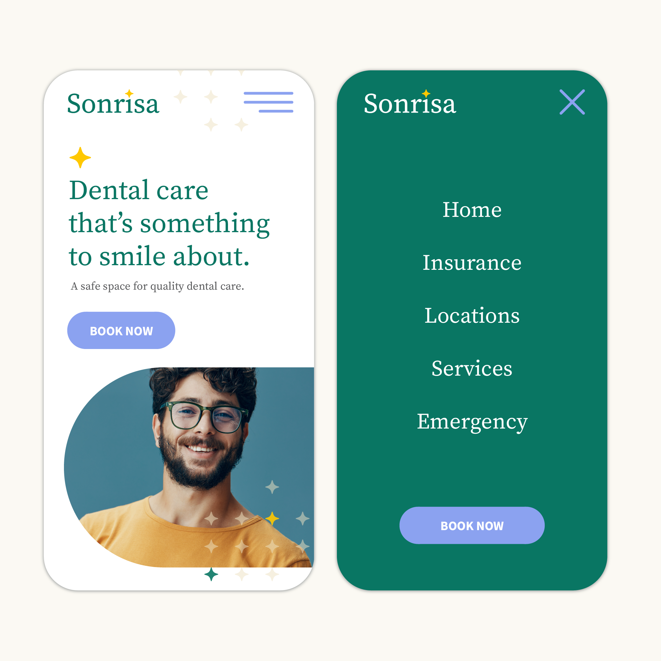
Another design note I had to fight myself on was my immediate desire to turn this into a dark website. I have a thing for dark sites, so it’s an easy pattern to fall into. Because this is a challenge, I went with a clean design style and a white-background website. When it comes to website design, keep it simple. I follow the rules of having a straightforward information architecture, making it easy for an end-user to navigate the site and get to the information they need. It’s very clear we want someone to book an appointment first. But if they’re not ready yet, they can still browse around the website and find a lot of useful information.
Branded Illustrations to Bring it Home
I love having the opportunity to add accent illustrations and icons to a brand. If done right, these elements can compliment and enhance a brand’s personality and the way it’s perceived by it’s target audience. This brand is embodying a sense of being approachable and professional. For this reason, I chose small illustrations to act as icons for some of their key offerings. I’m intentional about using different skin tones for the illustrations. It’s a nod to the understanding that all are welcome at Sonrisa. When you intentionally make elements like this a part of your brand, you don’t have to post everywhere about how inclusive you are. It’s a way of practicing what you preach.
In Conclusion
So I really had fun diving into this brand. I kind of wish it was real. Hey, if you liked this deep dive, you might also like some of our other design challenge write-ups. Here are some of our other fun design challenge adventures:
- Deep Dive: If We Designed a Fish Market Brand
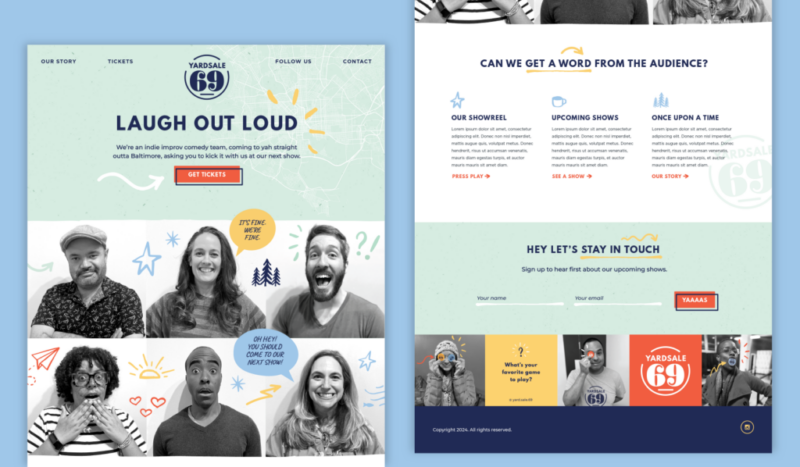
- Deep Dive: If We Branded an Improv Comedy Team
- Deep Dive: If We Designed a Landing Page for Baltimore
- Deep Dive: If We Designed a Boutique Sparking Water Brand
- Deep Dive: If We Designed a Mobile App for Weather
Thanks for taking a deep dive with us. Sign up for our monthly newsletter to learn more about what we’re up to. Hey, feel free to also reach out to us about your next creative project.
