We’re back at it again, using our design powers for play. This time I decided to participate in Dribbble‘s challenge to design a landing page dedicated to our hometown. For this project, I took a dive deep into all the fun and quirky elements of our charming city: Baltimore.
Step One: Creative Brainstorm
When you think of websites that are destination-focused, maybe the first image that comes to mind is a nice scenic view or skyline. A city in Hawaii may have an image of its jagged terrain with lush green plant life. And maybe a city like San Francisco will feature its iconic Golden Gate Bridge. Baltimore’s skyline has a few elevated views. But its visual claim-to-fame, as far as landscapes are concerned, is the inner harbor. The south side of Baltimore is built up around a harbor on the Chesapeake Bay. And on any given day you can stroll the waterfront.
We all know a scenic wide-lens photograph from some aerial viewpoint is stunning. Baltimore is full of iconic views, such as the Domino Sugar factory sign, the top of Federal Hill Park, the Patterson Park Pagoda, and so on. But when it comes to representing this fine city, these views from a zoomed-out perspective are all missing something.
Step Two, Think About What’s Important
One of the most quintessential things about Baltimore is the people that make up it’s vibrant communities. You can’t see Hon Fest with a zoomed-out view of the city. You also can’t see the dirt bike scene, or Light City, or a Sunday neighborhood farmers market. We have people, we have culture, and we have style. And most importantly, we have stories.
What’s paramount for a landing page is that we show the user what makes Baltimore different. And by this, I mean different from any other city page they land on. Let’s pretend our end-user is researching cool cities to travel to. So we need to wow and delight them, while knowing they likely have a browser window full of open tabs (no judgment!). So Baltimore has stories, but the real question is: What stories do we have that are unique and also have strong visuals?
Step Three: Find the Story
Here’s the quick cross-section that comes to mind for stories in Baltimore that are unique and also visually compelling:
- Our Dirt Bike Culture: The rumble and screech of a dirt bike is a familiar sound for those who reside in Baltimore. Dirt bikers are portrayed as rebels by law enforcement, contributing to a level of anarchy. It’s illegal to ride dirt bikes on Baltimore streets. But from their point of view, they are powerful. The subject of our dirt-bike culture has gained international attention in films and documentaries. Additionally, it shines a light on great organizations like B-360, who are using dirt bike culture to close the digital divide.
- Light City: Light City is a festival of light, music, and innovation that connects Baltimore together with awe-inspiring light art installations and performances throughout the city. A unique aspect of this festival is how they select neighborhoods to participate, matching them with visual artists to create light installations in their part of town. It’s easy to hop around the city in one night and explore its many flavors.
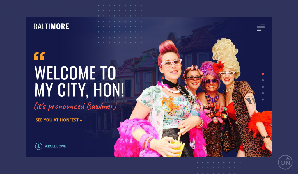
- HONFest: This festival celebrates the working women who helped make this great city what it is. “Hon”, short for Honey, is a classic Baltimore term of endearment. For generations, it has expressed the warmth and affection bestowed upon neighbors and visitors alike by our mothers and grandmothers. Since 1994, HONFest has grown from the tiny Baltimore’s Best Hon pageant to a nationally recognized festival that spans four city blocks.
As you can see, it’s a shortlist.
But this is only the tip of the iceberg for great stories in Baltimore. If this were a proper client project, we’d spend a couple of weeks diving into story content alone. One of the joys (and also challenges) of Dribbble’s project request, is that it needs to be completed quickly. I don’t have weeks or a couple of months, or the leverage of my team. I have just a few hours.
So from here, I did a quick internet search to see what photos were available for each of these stories. The chosen image would need to be lively, have personality, and also be easy to clip out people from its background. It also needed to be high enough resolution that it wouldn’t look pixelated, and not need color correcting because there is no time. Then, I landed on this beauty from Avenue News, in an article titled It’s a HONderful Life by Lisa Harlow. As soon as I saw it, I knew this was the one.
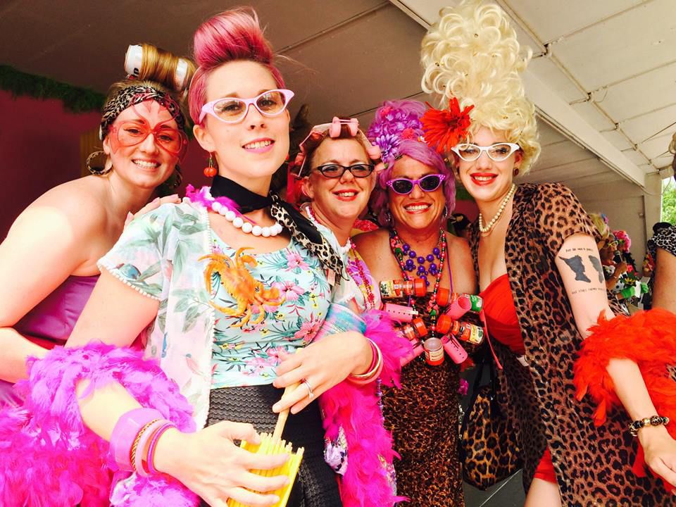
Photo Credit: Avenue News, It’s a HONderful Life by Lisa Harlow
Step Four: Think About Layout
There’s not enough time to do a formal layout and design process. That usually takes a few days and involves contemplating things like sitemap, wireframes, information architecture, and calls to action. Even without all these motions, I can still engage some of the most basic foundational concepts of webpage design:
- This isn’t a full website. It’s a landing page. So you don’t need a full menu, and given that it’s just the home screen of this landing page (and not the full scroll), having a complex top navigation can crowd the design and take away from a natural flow of content. In the spirit of less is more, let’s go with a compressed “hamburger” style menu (see that in the upper right corner). A user has to click on it to see a fully expanded menu for the website. This keeps the top of the design clean and allows more space for play.
- There’s more than one story to tell. Baltimore has several stories. Having a rotating banner allows for other stories, like our dirt bike scene and Light City, to also be in the spotlight. The banner can rotate automatically on a timer, and also provide some control for the user, by letting them advance the slides by clicking on the row of dotes on the right.
- Cities have layers. And although it’s important for our people’s personalities to be front and center, I still wanted to pay homage to our neighborhoods. If you look at the background of the design, you’ll see a scene that includes a line of our iconic colorful row homes. What if each rotating banner image had the subtle detail of a different city scene faded in the background?
- Have one clear line of content. So, the on-screen real-estate before a user inevitably has to scroll is smaller than you think. It’s best practice to have one mail call to action and line of messaging. This also allows space for the layout to breathe and room to take liberties with some design elements.
Step Five: Add Color, Style, and Flavor
What is the right balance of character and style, while still getting your message across? I think style and design should enhance a website, but never overpower the main objective.
I’m sure we’ve all come across a website where the design was beautiful but also distracting. This is seen aften when websites go over the top with moving pieces and micro-interactions. What’s the main objective for this landing page? It’s to get someone to dive deeper into the site’s content. Here’s how I thought about the flavor of this project:
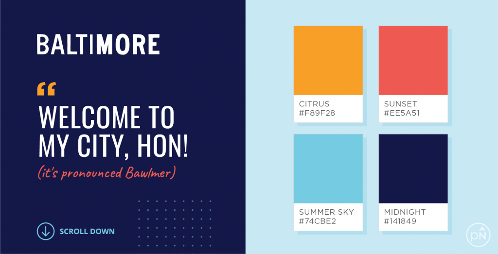
- What’s in a name? It’s very cool that the name “Baltimore” has the word “more” already in it. I’d love to see a campaign one day that played off the concept of “there’s MORE to see in BaltiMORE.” Maybe something like that already exists (I’m not sure). I created a subtle nod to this, by adding a little more weight to the letters “MORE” for the quick city logo.
- There’s no purple. Don’t panic. I know purple is the obvious color choice for Baltimore (seriously, everybody knows). It’s synonymous with our football team, the Baltimore Ravens. But, I think it’s overused (and don’t get me started on the city’s standard black and gold colors, because those are played out too). When you use the same colors for everything all the time, it gets hard to distinguish one thing from the other. Everything looks the same. When you drop the most obvious colors associated with Baltimore, it creates all this room for you to play. The colors that come to the surface in this project were inspired by the iconic scenes we have unfolding daily around our city.
- It’s not Old Bay, but we’ve got spice. One of the funny puns about our city is how we talk. Here, we pronounce Baltimore by saying Bawl-mer. We also call people Hon. I wanted this part of our personality to be peppered into the messaging. And not to the point where you can’t understand what the site is telling you (as there is no Google Translate for the language in Baltimore), but more where you immediately see that this city has style.
In Conclusion
This little project was relaxing, exciting, and only took up an afternoon of my time (#worthit!). I’m pleased with the result. If you’re a designer, and you’re on Dribbble, let’s sync up and have fun with future design challenges. And if you’re thinking of ways to add more spice to your work life, I strongly suggest creating time to simply play. I keep thinking of this quote that asks “Can you remember who you were, before the world told you who you should be?” by Charles Bukowski. As we grow in our years, it seems we lose sight of the carefree notion of play (whatever that looks like for you), free from judgment and worrying about end results. Take your joy back and be intentional about bringing this kind of fun back into your life.

Jess Watson is the CEO & Creative Director of Points North Studio. She's the co-organizer of Baltimore Womxn in Tech, a big believer in Baltimore city, and a pioneer of working remotely while traveling the globe.