There is a great platform, called Dribbble, to turn to for creative inspiration, especially when it comes to website design, illustration, and user experience. We’re on here a lot when we are researching and brainstorming ideas for a client’s website. I’ve always wanted to add our designs to the many that are featured daily, but seriously when will I have the time?
One of the things that we’ve been trying to incorporate at Points North is more time for play. Our creativity is important for our client projects, but it’s also fun to play around with different design software, and also to approach a project purely for the joy of it. There’s something to be said for taking ourselves through the creative process. To work with an idea and not be limited in execution.
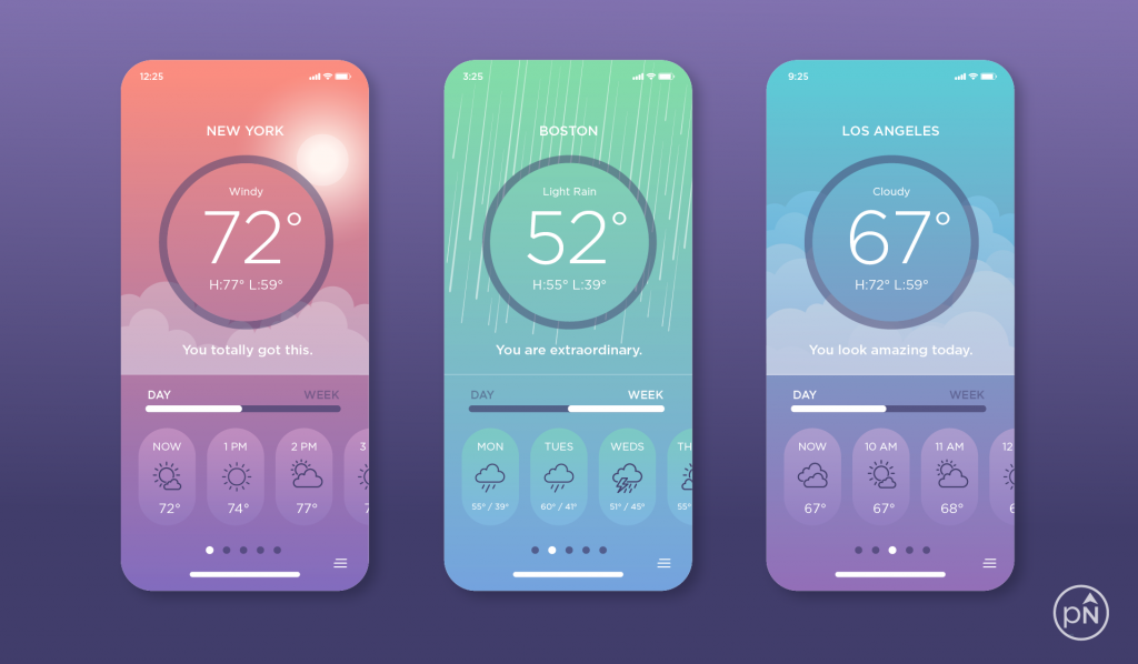
Sometimes, Dribbble will post design challenges just for the sake of having some creative fun. This week’s challenge was to design the main screen of a weather app. For whatever reason, I thought this was the perfect time to post something on their platform. I took a couple of hours and got to work.
Step One: Sketch it Out.
The first thing I did was create some thumbnail sketches in my grid notebook of what my current iPhone weather app looks like, along with some ways that it can be changed. True to form, I also checked out some of the shots submitted by other artists on the platform. They were all phenomenal (hello performance anxiety!).
So, if you are a UI/UX designer, you might think that the next thing I did was to open up a software program like Sketch, Weblow, or Figma. Ahhh, don’t be mad, but I’ve always been an Adobe Illustrator lady at heart. And before you start listing all the ways Illustrator won’t work, let me tell you that I have experience in Sketch, Webflow, and Figma. But, I was trained in Illustrator first. This is before any of these other software programs were on the scene. Adobe Illustrator comes so naturally to me, I know how to make it work for just about anything. And for a project task that’s just for the fun of it, there’s no better reason to stick with what I know.
Step Two, Think About What’s Important
The most important thing to me is a clean, simple design. For every element I add to a design, I need a rational, logical reason as to why it’s there. I don’t do well with clutter.
What’s most important to my user, who in this case is someone who’s going to be engaging with this app on a regular basis. So, in just taking a couple of minutes to think about that, this is what I came up with:
- The user wants to easily access the weather of the moment
- The user also wants to have access to hourly weather and the weekly forecast. These items should be straightforward in terms of accessibility and not require someone to leave the main screen to view them.
- Minimizing the number of screens adds to a smooth user experience. I can incorporate things like horizontal scrolling to keep a lot of their activity on one main screen.
- Also of importance, the experience of the app should be delightful.
Step Three: Add Some Color And Style
So, if I had hours or days to go through a standard creative process, and if I could leverage more people on my team for feedback and iterations, this project might look a lot different (and also take a lot longer). But I’m just doing this for fun, so it needs to be something that can be completed within a couple of hours.
For this reason, I kept the illustration straightforward, using flat design elements with some minor layering to show depth. I leveraged Web Gradients and UI Gradients to get ideas for color. Those that know me, know that I appreciate bold colors. But, that doesn’t always have to be the case. The subtle gradients here add a softness to the design. And then I became even more curious about how to incorporate weather imagery within the soft gradient tones.
Similarly, I wanted the icons to be flat icons, without a lot of detail.
It’s important to remember that icons are not full blown illustrations with excessive detail. When I approach icons, I always think to myself “what is the simplest form of the idea.”
For most design projects, you typically don’t want to have heavily detailed icons. They are meant to fill small spaces, and heavy detail can get lost in smaller sizes. I’m fortunate that it’s easy to come up with icons for the weather. That’s because there’s a huge bank of imagery to pick from (clouds, sun, rain, lightning). If I’m ever feeling stumped for coming up with an icon to represent something, I use The Noun Project for research and visual inspiration.
And then last but not least, the user needs to be delighted. I’m a big fan of curating the messages that come into my space (this is probably why I don’t have any major news network apps on my phone). The bonus feature on this app is that every time you open it, it gives you an affirmation or a compliment. I believe in being intentional about having positive messages in my life. And why should all the meditation and self-help apps have all the fun? I think it would be wonderful if my weather app reminded me “you got this!” when I open it up first thing in the morning.
In Conclusion
Within a couple of hours, I was able to design for fun and without restriction. It gave me so much joy just to be in my creative headspace, uninterrupted. I posted the concept on Dribbble, and it’s gotten great reviews so far. I’m excited to utilize Dribbble as a means of adding a little more playtime into my work week.

Jess Watson is the CEO & Creative Director of Points North Studio. She's the co-organizer of Baltimore Womxn in Tech, a big believer in Baltimore city, and a pioneer of working remotely while traveling the globe.