We’re back at it again, using our design powers for play. This time I decided to participate in a Dribbble design challenge to design the packaging for a new sparkling water brand. For this project, I took a dive deep into creating a design that would stand out on the shelf.
Step One: Creative Brainstorm
Small craft sparkling water, whether spiked or infused, has been drumming up attention over the past five years, and people are starting to take notice. I’m a sucker for a San Pellegrino, so this challenge provided an excellent opportunity to take a trip down the rabbit hole of sparkling water brands. In terms of branding, my favorites include Bubly, Recess, and Aha. I’m drawn to these brands because of their simple names, bold colors, and straightforward designs. It’s a good place to begin.
I wanted this brand to target young millennials (25-35 year-olds) and elder gen-z consumers (20-24 year-olds). A while back, we did some research on this target audience and learned how much they value authenticity when it comes to a brand and product. They are purposeful and conscientious with their spending and consume as a way to express individual identity. They don’t want a pretentious brand, but they do value a unique experience. From this research alone, we can see our boutique sparkling water brand likely being a certified B-Corp that gives back to the community or earth in some way.
Step Two: What’s in a Name?
“What’s in a name? That which we call a rose by any other name would smell as sweet.” – Shakespeare’s play, Romeo & Juliet.
This project needs a name. But, where do you even begin to find one? The first thing I did was look for words that were water-adjacent. Then I sought out what those words would be in different languages or interpreted differently. My goal was to find a two-syllable word that was easy to pronounce and rolled off the tongue. So, the first word was actually water. But specifically, I was seeking a more exotic name in another language. I found some good ones, including vesi (Finnish), ilma (Maltese), maji (Swahili), and ruwa (Hausa). Those are all fun names, but more research ensued.
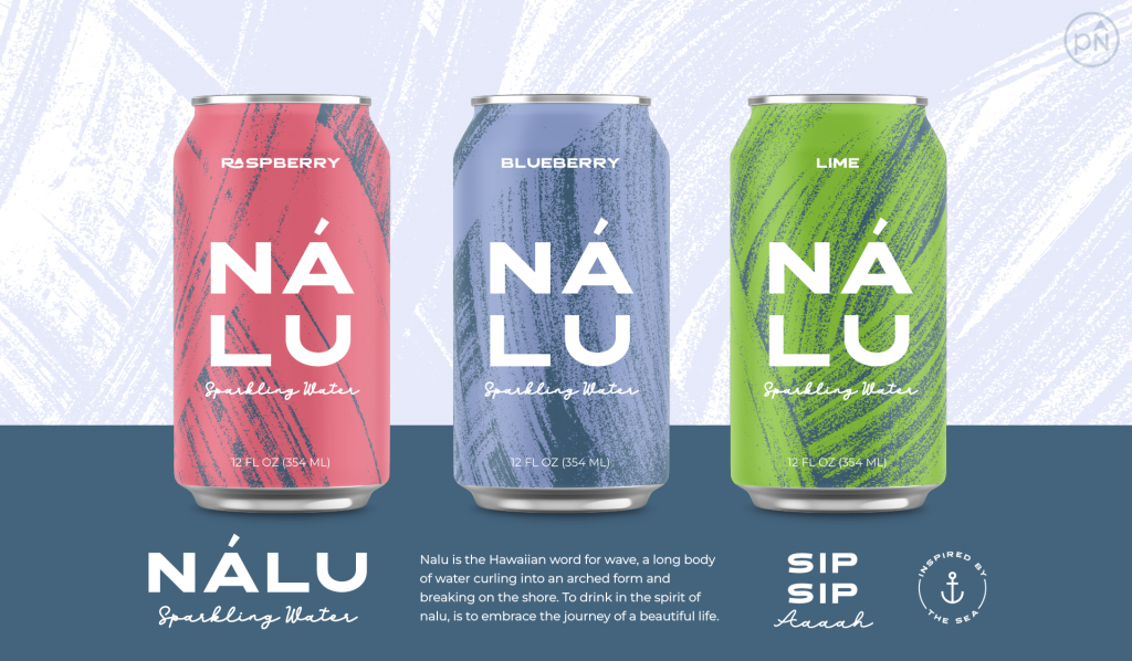
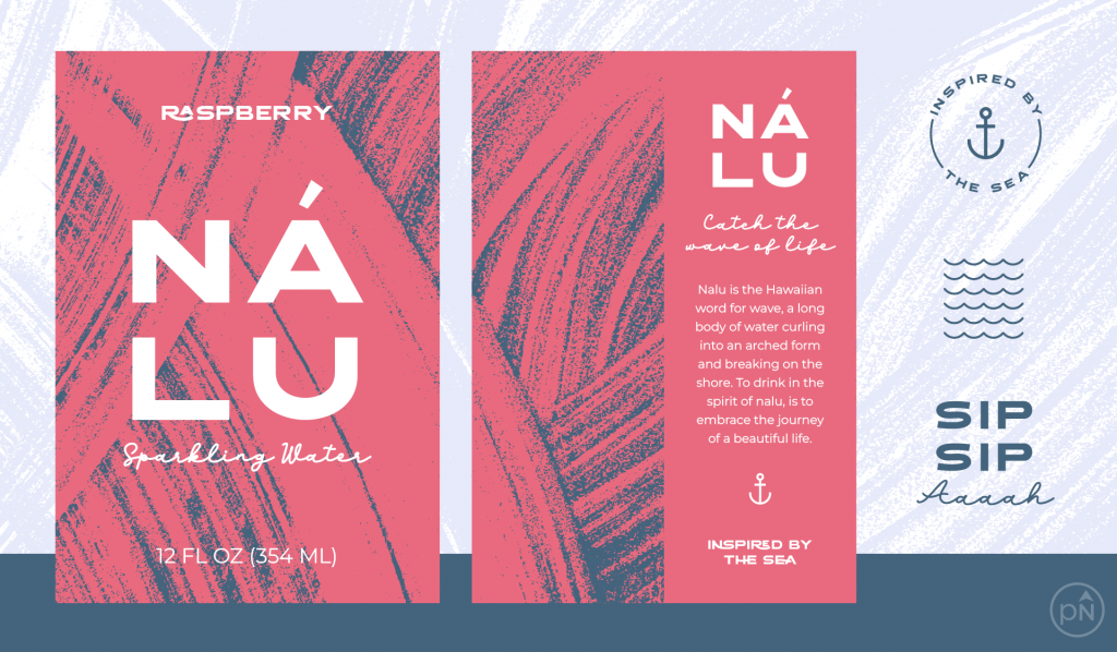
The second word I looked at was reef, as in barrier reef and coral. The question to answer: what are the names of barrier reefs around the globe? I found some good ones, like Lyra (in Papua New Guinea), Maro (in the north Hawaiian islands), and Minami (full name Minami Tori Shima, located in Japan). Very cool finds! The last word I investigated was wave, and from that I found onda (Corsican, Galician), aalto (Finnish) and nalu (Hawaiian). If we were working with a client and over the span of months, we would’ve gone down several rabbit holes to arrive at the perfect name. But with just a few minutes for this stage, I landed on the name Nalu.
Here’s why we love this word:
- Nalu is the Hawaiian word for wave, a long body of water curling into an arched form and breaking on the shore. (I mean this sounds like an origin story that writes itself!)
- It’s short and to the point, easy to say, and simple.
- I realized halfway through designing that rearranging these letters will also give you the word “luna,” and we all know of the harmonious relationship between the moon and the tide.
Step Three: Show Me Something Real
When you think of water, what images come to mind? I was thinking waves, oceans, and waterfalls. And then maybe based on the flavors, different fruits, and water bubbles. Sound familiar? It should because these images already exist on most of the sparkling water packaging you see out there. We get it, an image of an orange means it’s orange-infused water. How does Nalu stand out as a brand when a lot of the best ideas are already on the shelves? Here’s how I landed on the brush stroke background image for this brand:
- To be honest, my first ideas were nautical. Like, how cool would it be to release the Kraken into a design for sparkling water? But, I didn’t think I could successfully pull this off in a short amount of time. So my mind went to the notion of “keep it simple.” Less is more.
- With that, I got curious, what is the essence of a wave? It is an actual image of the wave? Or is that too literal? When you expand your view of what a wave is, in its natural form it is energy and movement. What does energy look and feel like?
- In searching on Creative Market, a place where you can download graphic resources, I found a set of brush textures entitled “Wave.” It was described as “a unique collection of hand-painted wave textures with a high-impact look. This collection is perfect for applications where you need an abstract background with a dramatic flair.” It was love at first sight.
Step Four: Bringing it All Together
After finding the design element that resonated with me, here’s step-by-step how it all came together:
- A quick brand. If you’re ever in need of a quick brand, a nice font pairing will do. And being a design studio, we’ve got a ton of fonts that we’ve licensed over the years (#guiltypleasure). Given our target audience, I’m thinking bold and fresh, but still simple and balanced (sigh, it sounds like I’m describing a drink, but I promise I’m talking about fonts). The font pairing that resonated the most is Leandro Regular, paired with Leandro Script.
- Color theory. Again, keep it simple. Since I’m not drawing fruits to represent flavors, I can use a solid color. Coming from a print background, I’m extra excited that the brush strokes backgrounds I found are also one color. Having a light navy blue against another color creates a nice contrast. It’s smooth and easy on the eyes. Navy then becomes the grounding color for the brand.
- Personality and story. Fun elements help to tell a brand’s story and bring everything to life. If you have a typographic logo mark, you can easily bring in fun emblems and icons to help tell the story. All of a sudden, we have a brand that I really want to see in a store now.
In Conclusion
This little project was fun and only took up a snowy Saturday morning (#worthit!). I’m pleased with the result. If you’re a designer, and you’re on Dribbble, let’s sync up and have fun with future design challenges. And if you’re thinking of ways to add more spice to your work life, I strongly suggest creating time to simply play. I was listening recently to an Audible podcast episode about play. It was by Mel Robbins and the series is entitled “Here’s Exactly What To Do.” Mel encourages us to remember what brought us joy back in our youth and to be intentional with planning for more fun in our lives. That’s right, put it on the calendar. Because if you don’t, something else is always going to take precedence. As we grow in our years, it seems we lose sight of the carefree notion of play (whatever that looks like for you), free from judgment and worrying about end results. Take your joy back and be intentional about bringing this kind of fun back into your life.

Jess Watson is the CEO & Creative Director of Points North Studio. She's the co-organizer of Baltimore Womxn in Tech, a big believer in Baltimore city, and a pioneer of working remotely while traveling the globe.