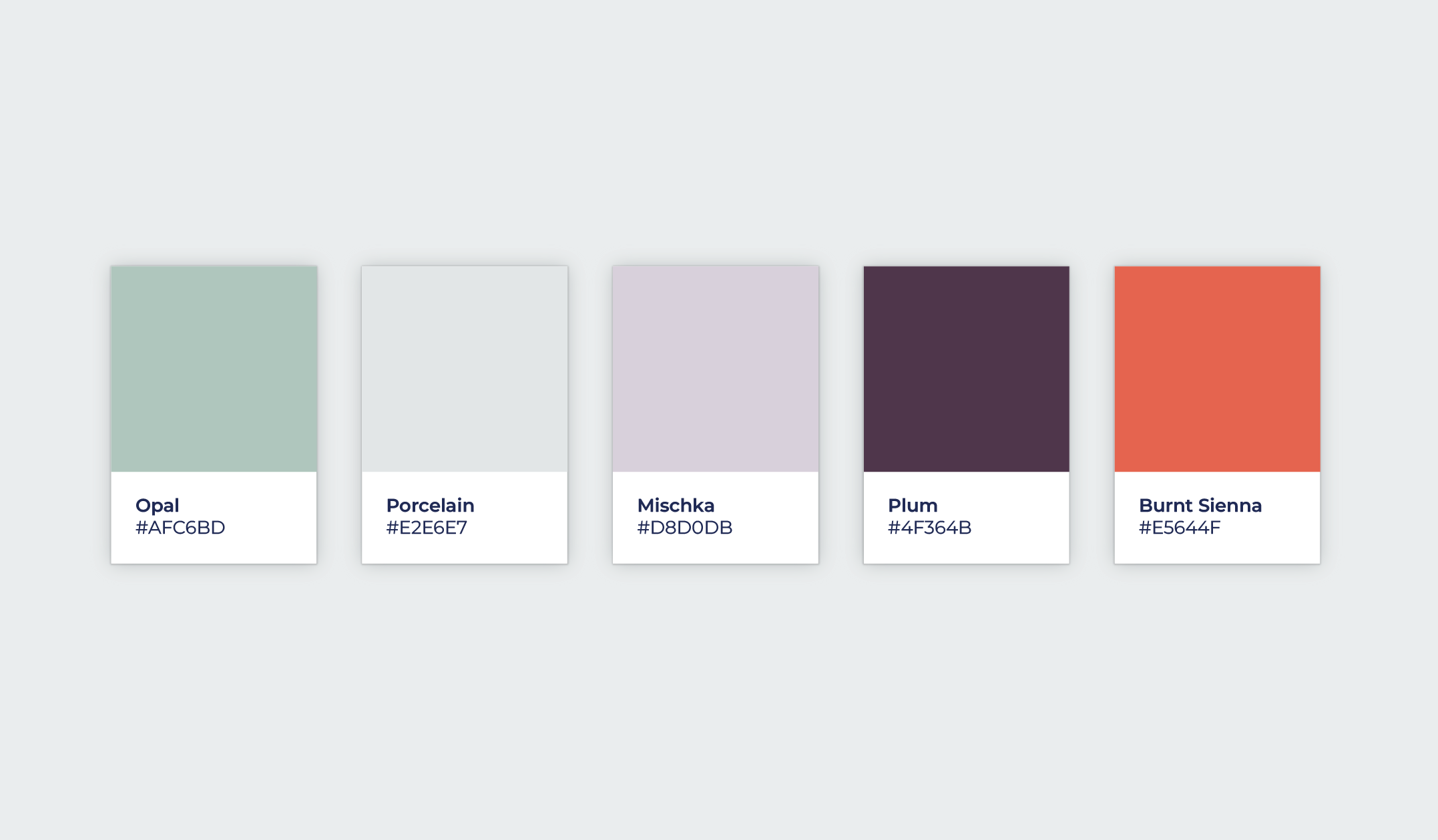
Remember when all B2B companies were pretty much branded with a strong shade of blue, and then paired with a bright green, or orange, or yellow? Businesses were just starting to embrace getting online. And for better or worse, blue was the color that embodied trust, longevity, and a sense of calm. No shade to those tried and true colors, but I’m glad that we’re seeing more color variety when it comes to corporate brands. A change in color can separate a business from the crowd.
In 2024, I started a weekly color post on LinkedIn where I created a new color palette (usually 4-5 colors) and invite others to discuss how it might be used and how it makes people feel. When I’m looking to creatively explore beyond our client projects, I pull a color palette from this series and go to town. For this challenge, I decided to take one of the suggestions from the LinkedIn post and run with it. This project was to design a brand identity for a corporate consulting group. Let’s go!
The Creative Process
The biggest rule for this challenge is to keep it quick—I limit myself to 5-6 hours from start to finish. It’s so easy to get lost in a side project and go too deep, which is why I set this time boundary. After all, we have other projects to tackle! For this round, I was inspired by the cooler temperatures of an East Coast winter, but I couldn’t resist adding a touch of warmth to balance out the palette.
What I love most about this challenge is how it encourages me to be playful and trust my first instincts. It’s a creative muscle I often flex in my improv comedy work outside the office, and it’s a great reminder to avoid overthinking—something we’re all guilty of in our adult lives. Now, let’s see what this winter-inspired palette can do for a business consulting group brand.
What’s in a Name?
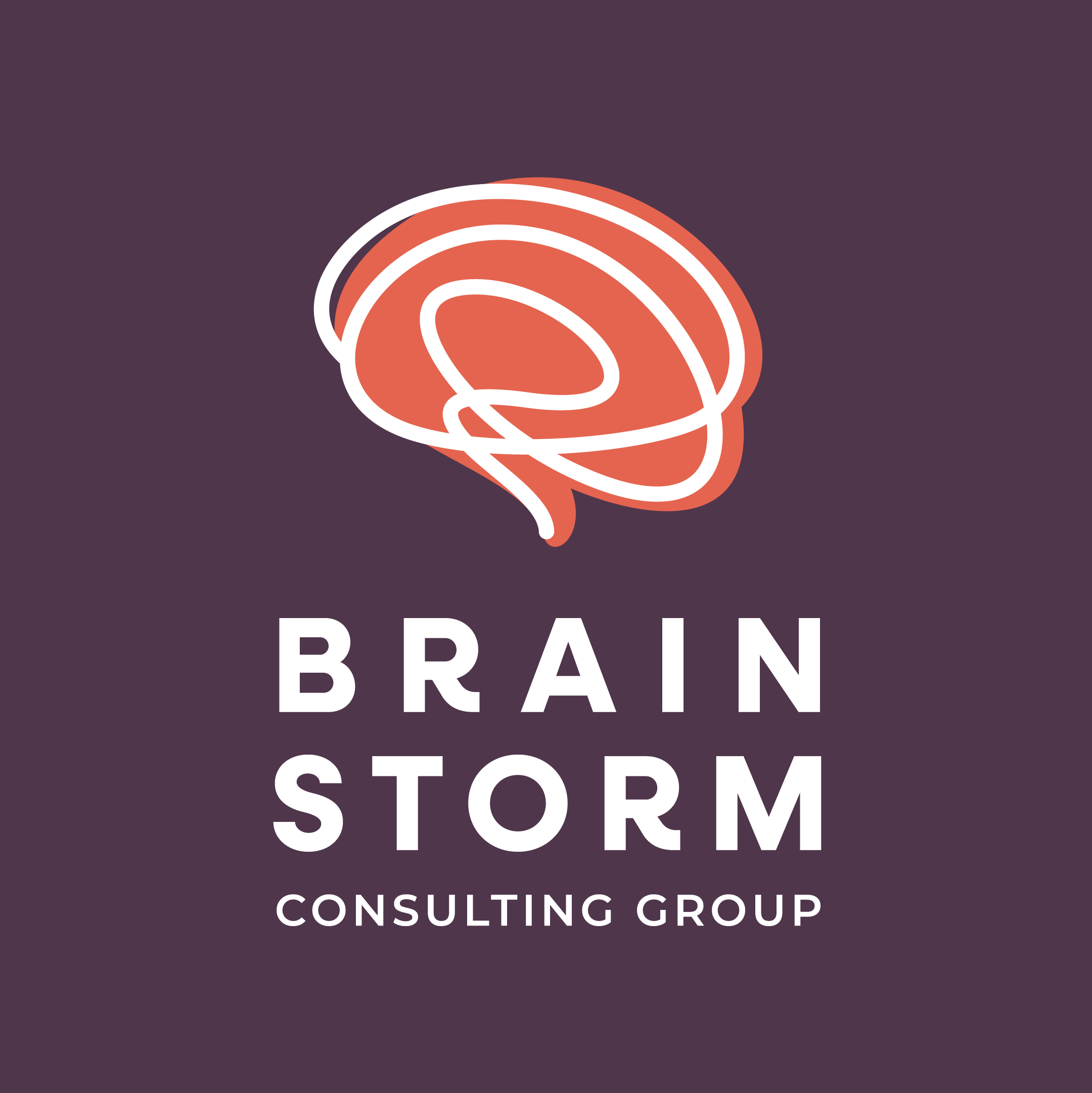
With the rise of AI everywhere, and the concern about how it will replace humans, I thought it would be a fun concept to brand a company that was trying to bring the human touch back to the workplace. And so, Brainstorm Consulting Group was born. A brainstorm is a creative process where individuals or groups generate a wide range of ideas, solutions, or concepts in response to a specific problem, question, or challenge. The goal of a brainstorm is to encourage free thinking, collaboration, and open expression without immediate judgment or criticism, allowing innovative and unexpected ideas to emerge. I chose the name Brainstorm Consulting Group because it was approachable and easily relatable.
Now it’s Time to Design
Okay, brainstorms are fun. They are messy and have a color-outside-the-lines personality about them. I love that. I wanted to design something that abstractly resembled a brain and also a storm. If you’re in the market for a logo design, let me tell you, the possibilities are endless when you break away from being so literal. There’s this fantastic line from the 2010 film, Inception, that goes “You need the simplest version of the idea – the one that will grow naturally in the subject’s mind.” Meaning that when attempting to implant an idea, it’s crucial to present the most basic, fundamental version of it, allowing the subject’s mind to naturally develop and expand upon it. The characters in that film were trying to get into someone’s mind and give them an idea that can grow and take root. I promise we’re not trying to do that. But there’s something to be said for thinking simply when it comes to design and branding.
For the Brainstorm Consulting Group logo, we have a suggestive flat shape of a brain, and a scribble that represents a storm. In my last deep dive challenge, I immediately went for a serif font to be a part of the logo. Here, because the logo is very simple, I prefer a sans-serif font pairing. The font I chose was Neulis by Adam Ladd. I love this font because it’s geometric and dependable, with some character flourishes for certain letters. Now that we have a great logo mark and a solid font pairing, we are off to the races.
Building Out the Brand
Thinking About Action Colors
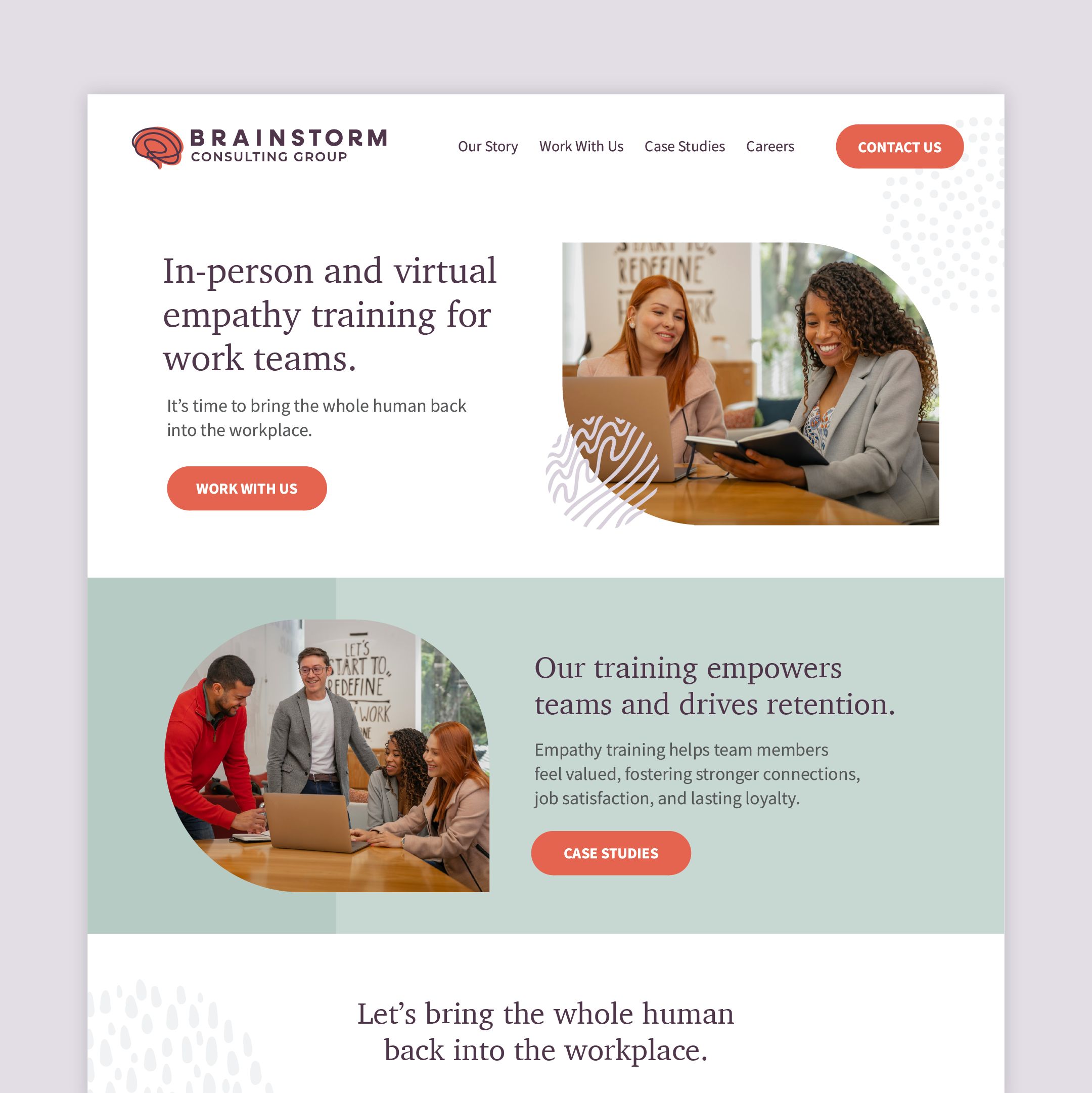
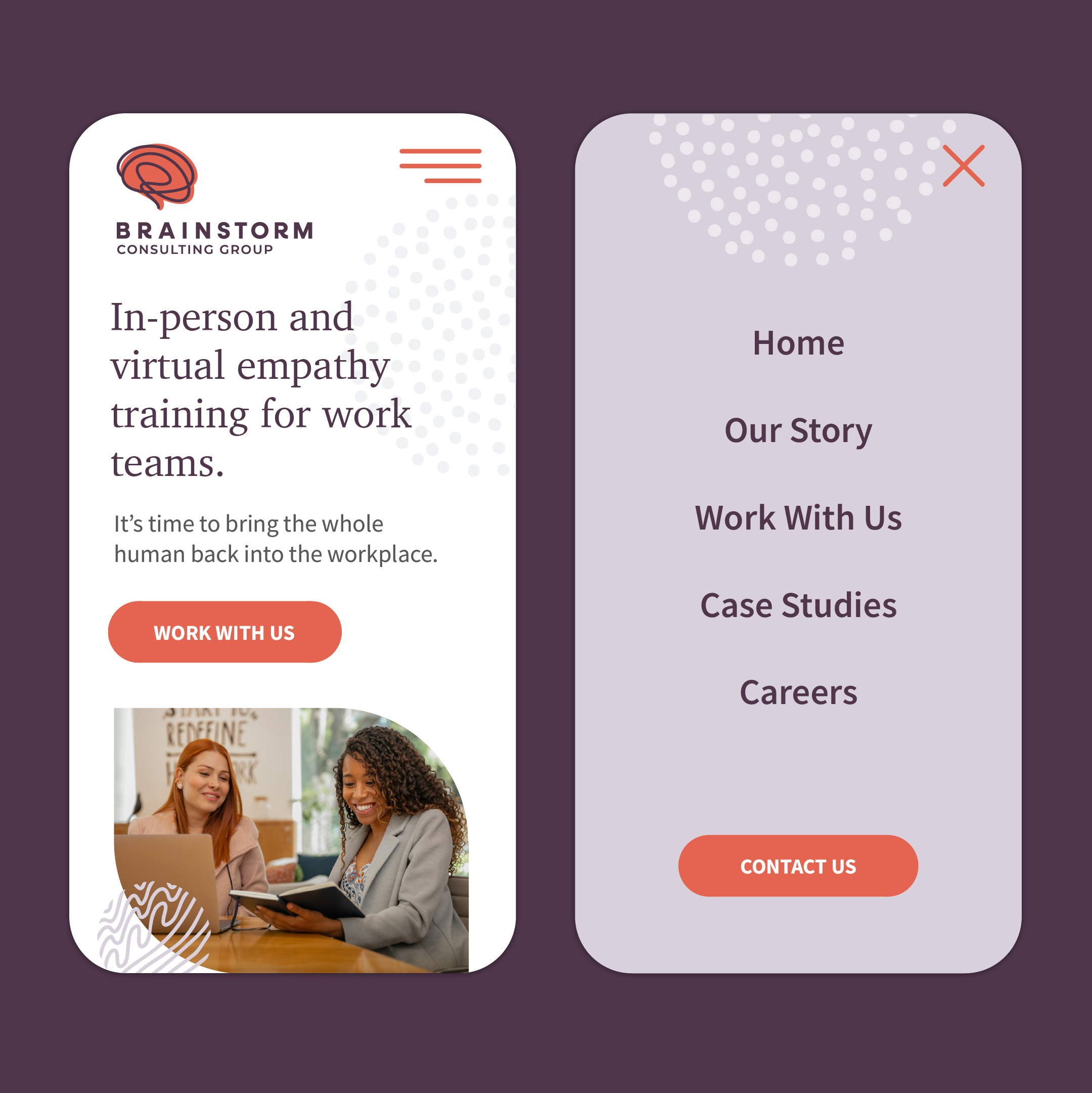
Because the majority of the colors for this brand are on the softer side, I chose the Burnt Sienna color (#E5644F) as the call-to-action color. It’s bold, bright, and easily recognizable. Too much of this color would be overpowering, but as a button, it’s the perfect amount.
Selecting the Right Photography
So the whole vibe of this brand is to bring the whole human back into the workplace. Brainstorm Consulting Group does this by offering in-person and virtual empathy training for work teams. Their selling point is that these workshops lead to a more positive work environment and employee retention (win!). At Points North, we’re incredibly intentional about photo use. For this brand, I thought it best to use photos of teams or of two people in a fun work environment, enjoying a conversation or a presentation.
Thinking about the Website
Here I go again fighting my desire for a dark website with bold splashes of color everywhere. The great thing about these challenges is that they are perfect safe spaces for going against the grain. So this time, I challenged myself to really be intentional about the use of the softer colors in the color palette. You’ll see them below showing up in background elements, and acting as natural dividers for the content on the homepage.
Branded Illustrations to Bring it Home
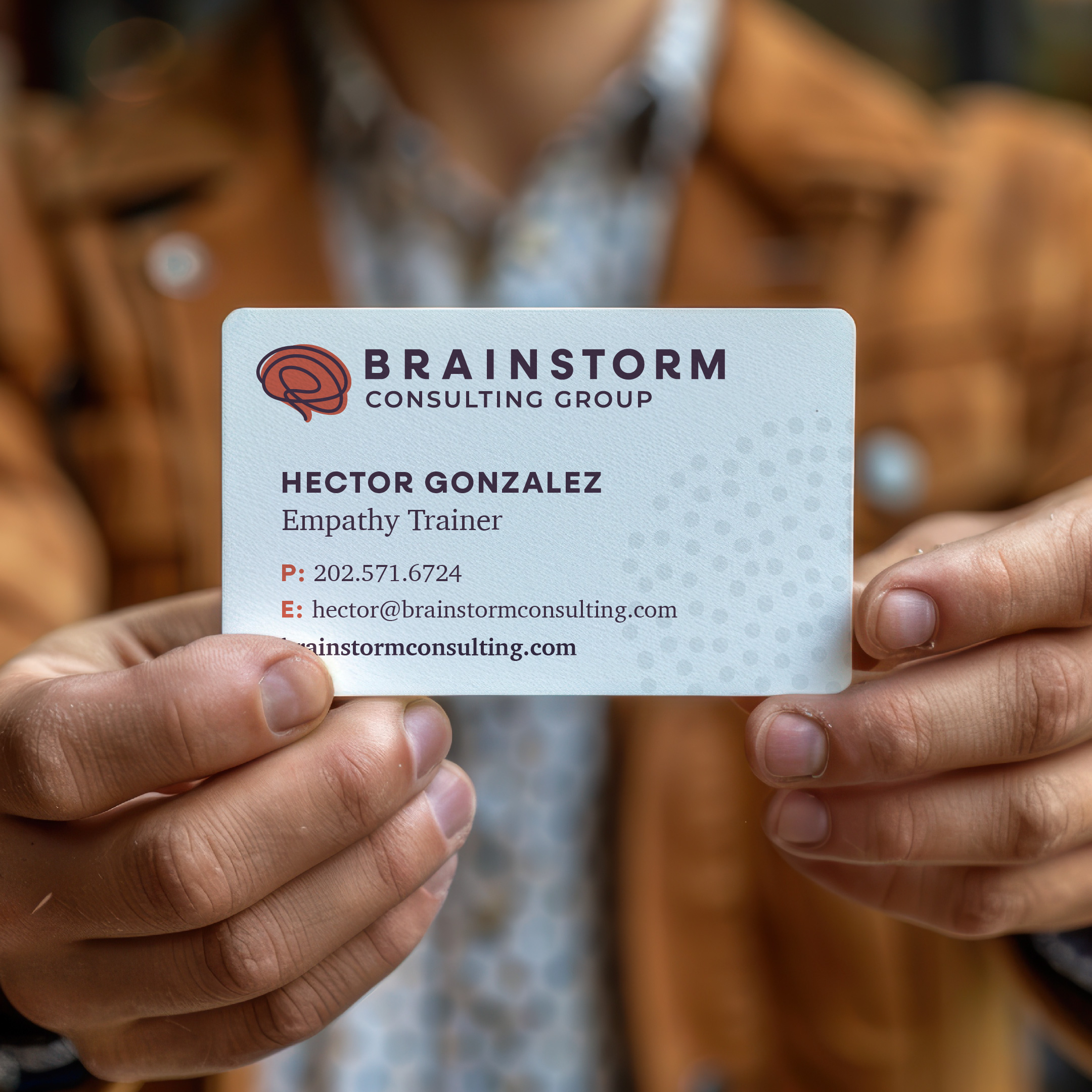
If you’re ever in a bind and short on strong photography (and you don’t want to use a bunch of stock photos), using illustration is the way to go. You can do something that uniquely compliments the brand personality. They are fun, playful, and often highlight the best parts of a company or organization. Now, I’m short on time, so I can’t spend hours working on super custom illustrations. But, I can create some very simple illustrative elements that pair nicely with the illustrative style of the logo. And with this, the project is complete.
In Conclusion
Good thing this company is just my imagination. Otherwise, it seems like a great place to work and might steal me away from Points North. Hey, if you liked this deep dive, you might also like some of our other design challenge write-ups. Here are some of our other fun design challenge adventures:
- Deep Dive: A Fresh Look for a Boutique Dental Practice
- Deep Dive: If We Designed a Fish Market Brand
- Deep Dive: If We Branded an Improv Comedy Team
- Deep Dive: If We Designed a Landing Page for Baltimore
- Deep Dive: If We Designed a Boutique Sparking Water Brand
- Deep Dive: If We Designed a Mobile App for Weather
Thanks for taking a deep dive with us. Sign up for our monthly newsletter to learn more about what we’re up to. Hey, feel free to also reach out to us about your next creative project.

