If your love language is Pantone colors and textures with depth, then please swipe right on us.
We can’t offer you any relationship advice here, or tell you the best spots in Baltimore for a romantic evening. What we can do is blog about the 2024 Pantone color of the year, and then introduce you to 5 designers we love, and have them tell you about the things they love. Love it?
The Pantone Color of the Year is an annual tradition started by the Pantone Color Institute. It began in 2000 when the Pantone Color Institute introduced “Cerulean Blue” as the inaugural Color of the Year. This decision aimed to reflect the mood and trends of the new millennium (and also do you remember Cerulean Blue from “The Devil Wears Prada”?!).
Each year, color experts carefully consider global influences, including socioeconomic factors, cultural trends, fashion, design, technology, and even political climates, to select a color. The winner is announced in December.
The Pantone Color of the Year serves as a symbolic representation of cultural trends and influences consumer preferences in design and purchasing decisions.
Designers, marketers, and creatives often incorporate the Color of the Year into their work, products, and marketing campaigns to stay current and tap into prevailing trends.
The 2024 color of the year is (drumroll) Peach Fuzz!
“In seeking a hue that echoes our innate yearning for closeness and connection, we chose a color radiant with warmth and modern elegance. A shade that resonates with compassion, offers a tactile embrace, and effortlessly bridges the youthful with the timeless.” – Leatrice Eiseman, Executive Director, Pantone Color Institute
Leatrice’s quote about Peach Fuzz hits on something every designer understands innately – the choices we make for projects, be it color, texture, font, layout, etc., aren’t made haphazardly. They’re intentional, and they have meaning. We interviewed 5 designers that we love and asked them questions about the things they love (ok, I’m going to be using that word a lot).
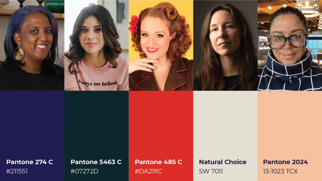
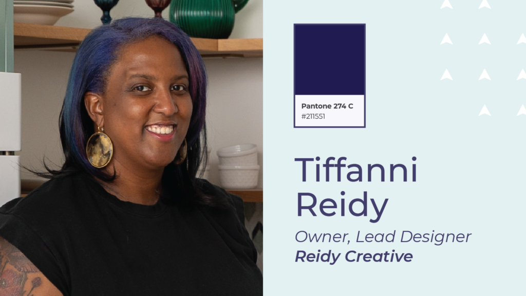
Tiffanni Reidy
Owner, Lead Designer – Reidy Creative
What inspires your design work?
I’m always inspired by color, but also by sunlight and how it changes colors. Finding the right hues and tones for each project is one of my favorite parts of each project.
What Pantone color do you just LOVE, and why?
Pantone 274 C because it’s a color with a lot of depth that’s almost navy, almost violet, always amazing.
What font do you LOVE and always find yourself using?
One of our main brand fonts is Brandon Grotesque, it feels simple and a little rounded on the edge, plus I always enjoy fonts that are quirky. This one has a Q which resembles a magnifying glass.
What texture or pattern do you LOVE, and why?
I’ve always been into herringbone. It’s gorgeous in floor patterns, wool, and tile work.
What’s one project that you just LOVED doing?
I’m currently finishing up Catalog Coffee which looks more like my original design intent that anything else thus far, so that has been really satisfying to see come to life.
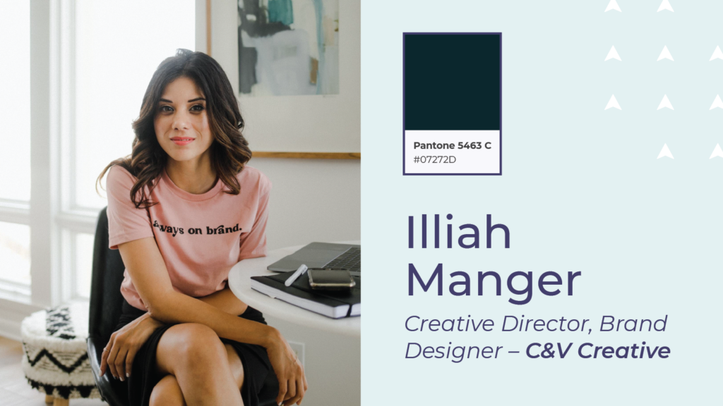
Illiah Manger
Creative Director, Brand Designer – C&V Creative
What inspires your design work?
My clients inspire my design work. They’re so creative, full of vision and multi-passionate. They all have a rich story to share, a desire to leave a legacy, and impact their community for good. I refer to psychology a lot in translating their intangibles to visuals, so strategically connecting their personal and business goals with their audience is essential to anything we design together. I also look at other art and design industries. I’m always curious about trends in fashion, interior design, industrial design (I’m obsessed with lighting) and new technology. My creative mind feels like a tree without its foliage if I’m not routinely immersing myself in art.
What Pantone color do you just LOVE, and why?
Choosing one Pantone color is like choosing one of my muses over the other! I love color so much, and I could spend hours sifting through color meanings to create a palette that works on a technical level and symbolic level for each brand. Each color has a culturally specific meaning, and I combine them to communicate core values to an audience. My brand color, 5463 C, a very dark cyan, is not green or blue or even black. If I had to pick one – that would be it!
What font do you LOVE and always find yourself using?
I’m always searching for new fonts with character but also a timeless quality. I’m currently obsessed with IvyMode and DeRegular and pair them with classics like Univers and Proxima Nova. I also can’t live without a sans serif with a lowercase L or I with a terminal. My name – Illiah – is unreadable without it.
What texture or pattern do you LOVE, and why?
I LOVE houndstooth. It’s so classic, but I also feel like you have to confidently own a punk attitude to pull it off. I’m still working on that!
What’s one project that you just LOVED doing?
One project I LOVED is just wrapping up – a brand refresh for an incredible brand and powerhouse artisan, Naturally London. Chrissy is all about low-effort luxury and sustainability, and her handcrafted products make your skin feel so healthy. Her goal with her products is to improve the health of your skin, especially your feet, to improve your overall wellness.
When we started, the Naturally London brand had all the pieces, so we took the best of what existed to elevate the visuals to a new cohesive and consistent level. After the refresh was complete, we continued working on applying the updated brand elements to her visual marketing, packaging, an industry event booth display, and even her Amazon storefront. I’m looking forward to collaborating again soon with Chrissy and her incredible brand!
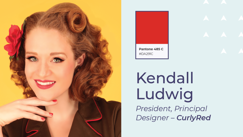
Kendall Ludwig
President, Principal Designer – CurlyRed
What inspires your design work?
I am inspired by all sorts of things: nature, music, books—but particularly, I love looking at vintage advertisements, books, catalogs, magazines, clothing and other artifacts. I want to examine how and why they were made.
What Pantone color do you just LOVE, and why?
I have a little beef with Pantone right now, but all that aside—Pantone 485 is my CurlyRed red. It’s bold, vibrant, warm and unapologetic for its redness.
What font do you LOVE and always find yourself using?
I’ve always loved Century Gothic. I don’t use it for everything (it’s mostly used internally for CurlyRed assets), but I like that it’s clean and super-readable.
What texture or pattern do you LOVE, and why?
Again, I love to look at vintage patterns, whether it’s on fabric, wallpaper, furniture, or hat boxes.
What’s one project that you just LOVED doing?
Most recently, I had a blast doing branding and package design for a regional company called Western Maryland Lemonade. They have a great product and now their look reflects that. Every time I see it on a grocery shelf or in a restaurant, I get a little thrill!
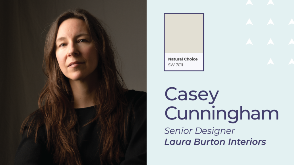
Casey Cunningham
Senior Designer – Laura Burton Interiors
What inspires your design work?
Each of our clients tend to be pretty different. If they have a storied piece of furniture, a favorite travel destination or a meaningful piece of art, I’ll start there. If not, rugs are my favorite item to select, so I often like to start there and build a space inspired by the rug.
What Pantone color do you just LOVE, and why?
As an interior designer, I tend to work more with paint decks than Pantone colors. I’m all about a blank slate for the negative space supporting interesting art and furniture. I love Sherwin Williams Natural Choice SW7011, a warm white or something off black like Iron Ore SW7069 for walls. Nothing too stark or sterile. Green is my absolute favorite color in almost any form, but especially a dark olive green like Sherwin Williams Secret Garden SW6181. It’s a rich color but is also basically neutral so you can accent with a spicier color like aqua, teal or terra cotta.
What font do you LOVE and always find yourself using?
Our standard office font is Century Gothic — it’s clean and easy to read.
What texture or pattern do you LOVE, and why?
I love a simple stripe for color, quality linen or almost any menswear pattern or texture. I love and admire people who are bold with color and pattern. They are some of my favorite people. But too much pattern starts to feel chaotic in my own environment. High-value contrast neutral solids with jewel tone accents and sassy artwork are my jam.
What’s one project that you just LOVED doing?
It’s actually a project I’m working on now! It’s a (Texas) hill country modern home. The architecture is clean and minimal, and it will serve as a perfect background to layer in the stories. The client’s mother-in-law gave her her accordion and she wants to display it in a prominent place. She also has a table in which the top was made from a Parisian dance floor (I’m obsessed!). She’s an avid world traveler with quite a few collected pieces. And most importantly, she has a great sense of humor and doesn’t take herself too seriously. I can’t wait to see it all come together!
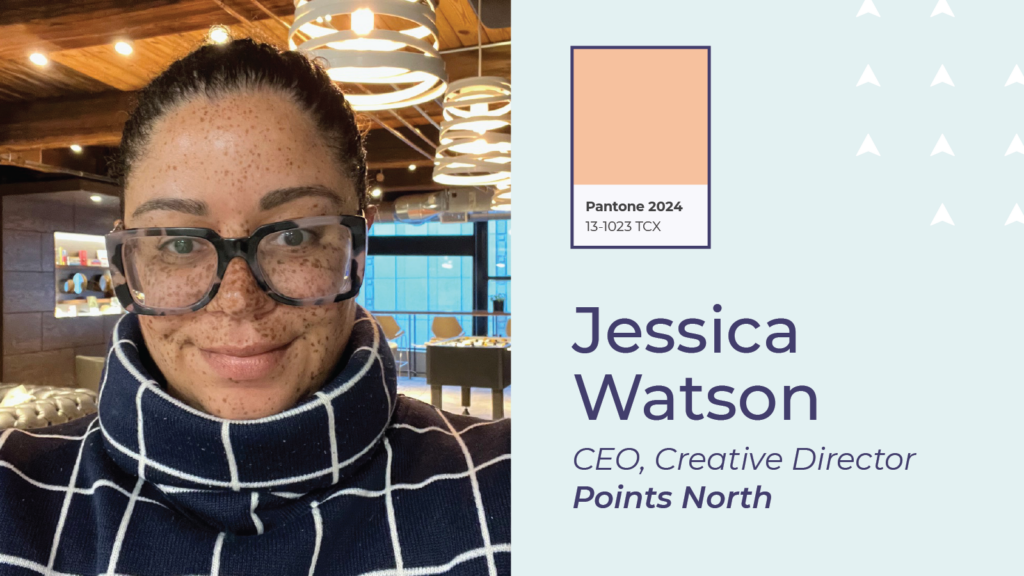
Jessica Watson
CEO, Creative Director – Points North
What inspires your design work?
My design aesthetic is inspired by my unquenchable desire to place myself into different spaces and experiences, both locally and all around the globe. Sampling Malbec wines in Mendoza, Argentina? Yes! Zipping through the eccentric shops in the maze that is the medina in Marrakech? Absolutely. Trek around a turquoise blue lake in Banff National Park, Alberta? Let’s go! In these spaces I get to connect with people, embrace nature, experience culture, and immerse myself in art. The overall themes that tend to always shine through include the notion that less is more, that there has to be a balance between visuals and story, and that even the smallest details matter.
What Pantone color do you just LOVE, and why?
The Pantone color I’m loving right now is the new 2024 Color of the Year, Peach Fuzz (PANTONE 13-1023). I may be partial to peach fuzz because every summer I go to a pick-your-own farm and I load up a cardboard carton full of them. I love how peaches harbor a variety of warm colors, and their soft touch. I’m excited to see where we can use this color this year.
What font do you LOVE and always find yourself using?
I think every designer has their line-up of classic fonts that they will always love, and their shortlist of go-to fonts that always show well. I’m going to answer this question a little differently, by talking about a font that I’m falling in love with right now. It’s called Bayard, and it’s a unique sans-serif typeface inspired by signs from the 1963 March On Washington For Jobs and Freedom. It was created by the foundry Vocal, which is “for the creative that cares about telling the stories of the people we serve.” This font has an incredible backstory grounded in a strong foundation of African American history, and it shows well on large surface areas (like website banners and poster prints where the words are the main focus).
What texture or pattern do you LOVE, and why?
One of my favorite patterns is the Flor del Panot in Barcelona. It’s a step-and-repeat flower pattern that can be seen on the paved sidewalks and streets through many of the neighborhoods in Barcelona. This pattern has a lot of history for the city. In 1906, the city had a major problem with the accumulation of mud on its streets. Every time it rained, the streets would fill with it. This was due to improper street surfacing all throughout the city. The solution became these embossed tiles, which helped to drain rainwater, and this Flor del Panot became a simple yet iconic symbol that represents the culture of Barcelona. If you ever visit, look down, and you’ll be pleasantly surprised. You’ll also find the symbol on souvenirs, apparel, and accessories. For me, it’s the perfect example of how something simple can over time embody story, history, and personality.
What’s one project that you just LOVED doing?
It’s very difficult for me to pick a favorite client project. So, I’m going to flip the script and talk a little bit about our passion project. Since 2015, we’ve been doing a quarterly happy hour community gathering called “Have A Nice Day Project”. We write positive messages on blank coffee cup sleeves and then donate those sleeves to locally-owned cafes in Baltimore city. A city is only as strong as its community. This project started as a social experiment to demonstrate how we’re all connected. You can make someone’s day, even if you never get to meet them. It’s a feel-good project, from start to finish.
In the world of design, love is in the details—the carefully chosen color palettes, the thoughtfully curated fonts, the intricately crafted patterns. And as these designers show, there’s nothing they love more than bringing those details to life in their work.
So here’s to the designers who infuse love into every project, and to the colors and textures that inspire us all. May your designs be bold, your palettes be vibrant, and your stories be told with passion and purpose.

Naomi Oriol is a Customer Experience Specialist with over seven years in her profession. Her expertise include customer experience design, service recovery, quality and training, customer insights, self-service programs, leadership, and project management.