Introduction
It’s no secret that I moonlight as a performer on an improv comedy team that performs around Baltimore. What started out as an early pandemic hobby has blossomed into what I jokingly call free therapy.
It’s been an opportunity to be playful and silly, which are traits we often lose as we grow into adulthood. Additionally, there are several skills in improv that easily carry-over into the workplace and into relationships. This includes active listening, working together as a team, developing effective communication skills, and being adaptable to changing circumstances.
Step One: Understand the Environment
Truthfully it’s rare for an improv team to have a brand and website. Which is part of what makes this a fun challenge. For a challenge like this, I like to spend just a few hours on the project in total, to flush out the idea. It helps that I run the social media for the team. So, let’s get some basics out of the way about the improv comedy world in Baltimore.
What is Improv Comedy?
Improvisational comedy, often abbreviated as improv comedy, is a form of live theater in which most or all of what is performed is created spontaneously by the performers without a script. In improv comedy, the performers, known as improvisers or players, rely on their creativity, quick thinking, and collaboration to create scenes, characters, and dialogue on the spot. The primary goal is to entertain the audience through humor and wit.
What is an indie team?
An independent (indie) team is a group of performers who organize to form a team that practices and performs regularly. In the world of improv comedy, there are house teams and indie teams. Both refer to groups of improvisers who perform together, but there are some key differences between the two. A house team is put together by the theater and performs regularly at that venue. There is training and development, a consistent schedule, and usually a long-term commitment. An indie team is formed by its members. It’s usually more flexible and has a more relaxed commitment structure. It also offers a great opportunity for improvisers from diverse backgrounds to come together and perform.
I met my teammates largely through classes and workshops at Baltimore Improv Group (BIG) Theater. We operate under the same code of conduct as the house teams at the theater. We also practice regularly and work with a coach. And one of the best perks is that many of us knew each other before joining the team.
Is improv comedy well-known in Baltimore?
Yes and no. I actually think the comedy scene in Baltimore is ripe for a resurgence. Over the past few years, smaller comedy venues have been popping up in neighborhoods, and other establishments (bars, etc) are hosting comedy nights at their venues. But when most people think of comedy, they tend to think of stand-up comedians. It’s also true that many comedians and actors start off in improv. Because improv isn’t an everyday phrase, building out a brand for an indie team should include some other keywords and phrases to help the greater audience understand more what this is. We recommend adding “comedy” and “laugh out loud” to help get our point across.
How did the team get their name?
Team names for improv comedy troupes are usually inspired by some inside joke between the team, or a common theme that kept repeating itself in practice or class. Our name came from a scene done in one of our classes. Two characters went out on a first date. They met on an app and the guy’s profile name was “YardSale69.” It was so funny that it just stuck. Sometimes the best jokes and scenarios happen in real time on the spot. One of the criticisms of this is that if you’re just listing the name of the group, it’s a bit obscure and a wider audience doesn’t know what they’re reading about.
Are there any other obstacles?
The biggest obstacle is that there isn’t a lot of money in indie team improv. I point that out to note that it would be rare for any indie improv team to he branded and have a professional look. Most teams use Instagram to promote their shows, and their social media account doubles as a web page. At the same time, looking official and having an online presence accomplishes two goals simultaneously. First, it signals to audience members and show organizers that this team is serious and means business. In our social posts, we tag everyone we work with to help spread the word and support each other. Second, it signals to team members that they are a part of something real and authentic, which is very exciting.
Step Two: Working With What We Do Have
It’s easy to get lost in the nuances and details of what might work and what might not work when it comes to design. Despite some small limitations, there’s actually a lot here that we can pull from for designing. Now that we’ve outlined the environment, let’s talk about what we do have.
Big emotion and fun personalities
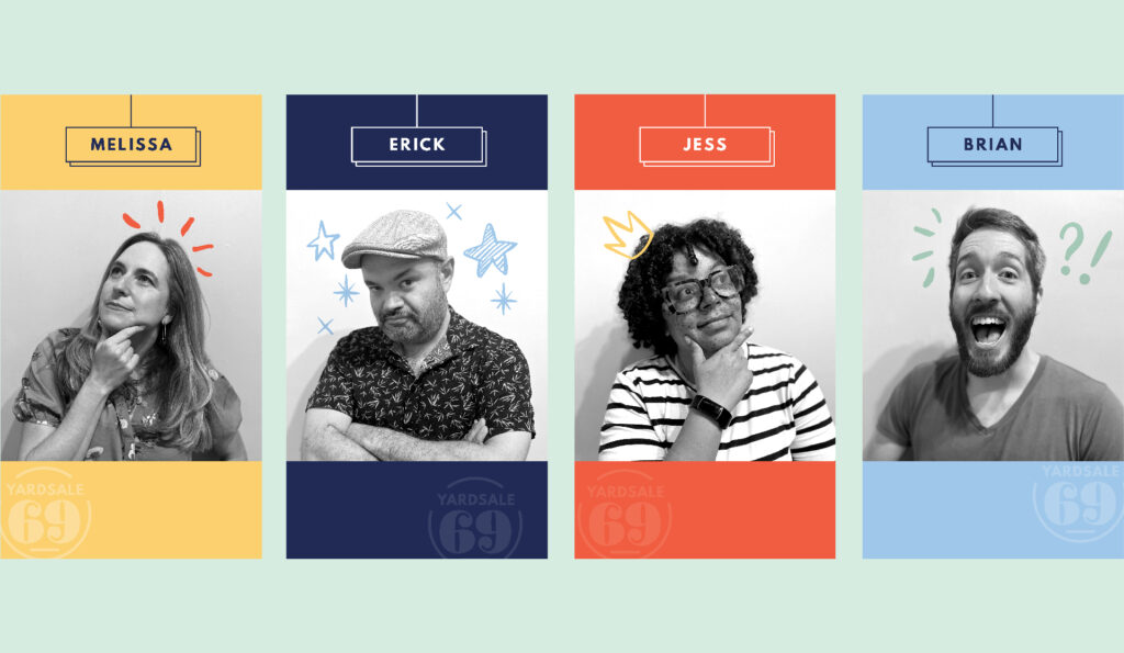
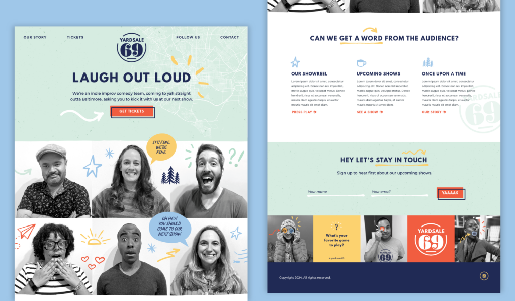
Okay, everyone on this team is a character. And because they perform on stage, they are not camera shy. I can use that to my advantage by having them pose for a bunch of headshot photos upfront. In each photo, I ask them to show me a different emotion (angry, excited, happy, playful). One thing I noticed up front is that the lighting in the theater isn’t always the best. But, switching the photos to black and white allow for me to quickly make some adjustments to the lighting and contrast to get a more uniform look for all the photos. This is true no matter where they are taken in the theater. We also
Bring the audience into the action
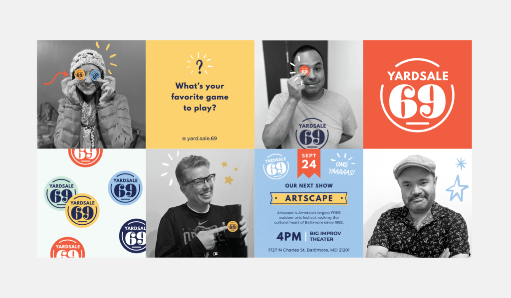
So, there’s not a lot of content when it comes to improv. Especially because we’re not at a point where we have the resources to do videos of our shows (yet!). So what’s an easy way to invite the audience to play with us, without breaking the bank? Stickers. Once we had our brand established, we bulk-ordered stickers using StickerMule. We ordered them in our different brand colors, and then gave them out after shows. This way, people can choose the color sticker that resonates with them the most. In giving out the stickers, we ask folks to strike a fun pose so we can snap a photo and feature them on our Instagram feed. It’s a simple request that invites someone to be silly, and then ultimately it gives us a plethora of options for photo content, which we can leverage multiple times over.
Keep it simple
We adhere to a fundamental principle in design: it should enhance the work rather than overshadow it. Design plays a crucial role in adding color, life, and personality to creations. However, it should do so without competing for attention. Given the nature of this rapid design challenge, our approach is to keep it simple.
Step Three: Using Design to Create a Unique Look
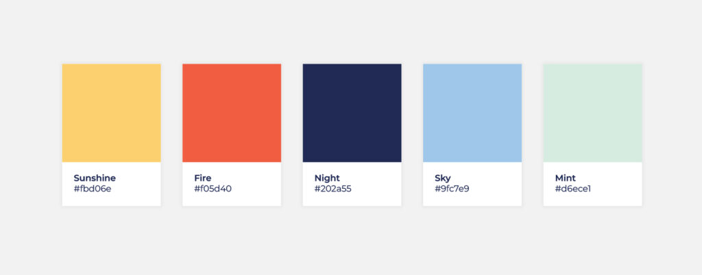
I like for some of our design challenge projects to include one of our brand colors. It’s part of my desire to have things look like they are under the same umbrella as Points North, like we’re all connected. But also, it’s a nod to making bold choices with color. For this project, we carried over our orange (which presents as a warm red color), and then surrounded it with some fun complimentary colors to build out the brand.
When it came to creating a brand color palette, here’s what we took into consideration:
- Can these colors stand alone, as big background colors or solid blocks of colors?
- Will these colors look nice when placed on or next to black-and-white photos?
- Will these colors look nice when placed next to each other?
Creating a Fun Look
When it came to creating the logo, we wanted something that would accomplish three goals:
- Be a fun shape that we can turn into a branded sticker without too much cost or trouble.
- Highlight the similarities between the letters 6 and 9
- Be easy to read and recognize over time
We actually went through a couple of iterations before we arrived at the perfect font for the 6 and 9 of this name. Because the 6 and 9 are so fancy, to acheive balance, we went with a more straightforward font for the name YardSale. The font we chose was League Spartan, This is a typeface based on early 20th century American geometric sans serifs.
Adding an element of play
The next thing we needed to think about was how to make this brand playful. Time is of the essence, meaning that we have no time or budget to custom illustrate something specific to this project. So, went on VectorStock and purchased some hand-drawn elements. This helps us out for several reasons:
- Believe it or not, not every design element needs to be created from scratch. Sometimes, you can use stock illustration sites to find a look and feel that is very similar to what you’re envisioning. This saves on time and resources.
- We wanted the hand-drawn elements to be playful, so that we could use them to enhance the personality of the photos, and add accents to a website and other social posts. You’ll see below that the elements we chose are repeated and reused tastefully throughout the project. Overtime this style will become synonymous with the brand.
- Design can help tell a story. With this project, the illustrative elements show a playful side to this team and brand, which is exactly what improv comedy is all about.
Pulling everything together
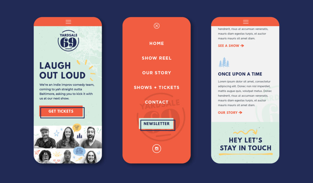
I’m a huge fan of websites that don’t start off flushed white. Meaning, there is untapped potential in expanding the background of your website to be a color other than white.
Right now, this can help you stand out from the crowd, and give someone a reason to linger on your website longer. When doing this, you must still adhere to basic website accessibility standards. You should continue to be mindful of best practices and the contrast ratio between background color and text. The lightest color in our palette is mint (#d6ece1), and that’s the perfect background color for a playful website. From there we use the color Night (#202a55) for our text, and the color Fire (#f05d40) as our action color for buttons.
The floods of color and bold choices pair up nicely with the black and white photos, pulling together a unified look for YardSale69. From just a simple website and brand, we’re already intrigued and want to learn more about this team and where they are performing.

In Conclusion
Hey, if you liked this deep dive, you might also like some of our other design challenge write-ups. Here are some of our other fun design challenge adventures:
- Deep Dive: If We Designed a Landing Page for Baltimore
- Deep Dive: If We Designed a Boutique Sparking Water Brand
- Deep Dive: If We Designed a Mobile App for Weather
Thanks for taking a deep dive with us. Sign up for our monthly newsletter to learn more about what we’re up to.
