Sweet
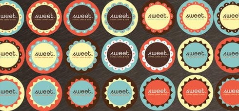
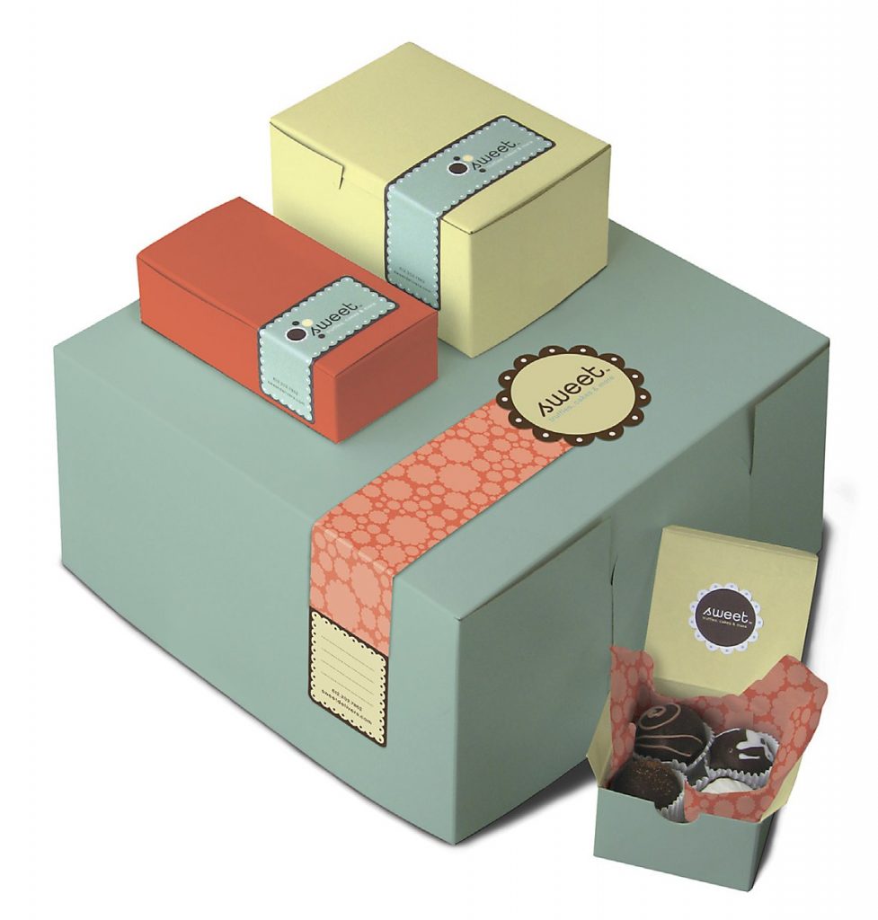
Designing for candy is so much fun! In fact, the sweet color palette (of chocolate brown mixed with bold colors such as turquoise, pinks, and blues for example) was a very popular trend in 2009. We also expect it to continue to be in the spotlight for 2010. Afterall, we are convinced that you cannot go wrong with dark chocolate brown. This “Sweet” packaging was designed by HartungKemp.
Why This Design Works:
This is our expert analysis for this design.
- The color palette for this package is eye catching. You instantly know that there are chocolates or some kind of decedent dessert inside. Pastels often trigger the thought of icing (like on a cake or cookie), light in color, smooth and sometimes fluffy. The bold coral (orange-like) color warms up the palette and adds a extra punch. The dark brown color automatically triggers an association to food, sweets, dark chocolate. Since this design is minimal, you have to rely very heavily on color to get your point across.
- The design itself is simple, which is very effective because you donât want to overpower the very detailed sweets inside. You want to compliment them with solid colors and very basic packaging.
- There is a lot of emphasis on circles in this design. The stickers have circles in different colors (very smart to have a variety, it makes you want to look at all of them). The coral colored tissue paper features a circular pattern as well. This more than flatters the goodies that are contained in the box. Yes, if this is a bakery, you can expect a bulk of their sweets to be round (cakes, cookies, etc). What a perfect way to tie placing a round item into a square box.

Jessica Watson
Jess Watson is the CEO & Creative Director of Points North Studio. She's the co-organizer of Baltimore Womxn in Tech, a big believer in Baltimore city, and a pioneer of working remotely while traveling the globe.