Welcome to Color Theory Lab
If you follow along with my weekly color posts on LinkedIn, you know I love a good palette—how it feels, where it might live, and the kind of story it might tell. Color Theory Lab is the space where those palettes step into the real world.
Each lab is a quick creative experiment, approximately two hours, where I test how a palette performs through things like web layouts, icons, or social templates. It’s not about perfection; it’s about curiosity, storytelling, and seeing color theory in action.
This is where we test the theory.
What Inspired This Palette
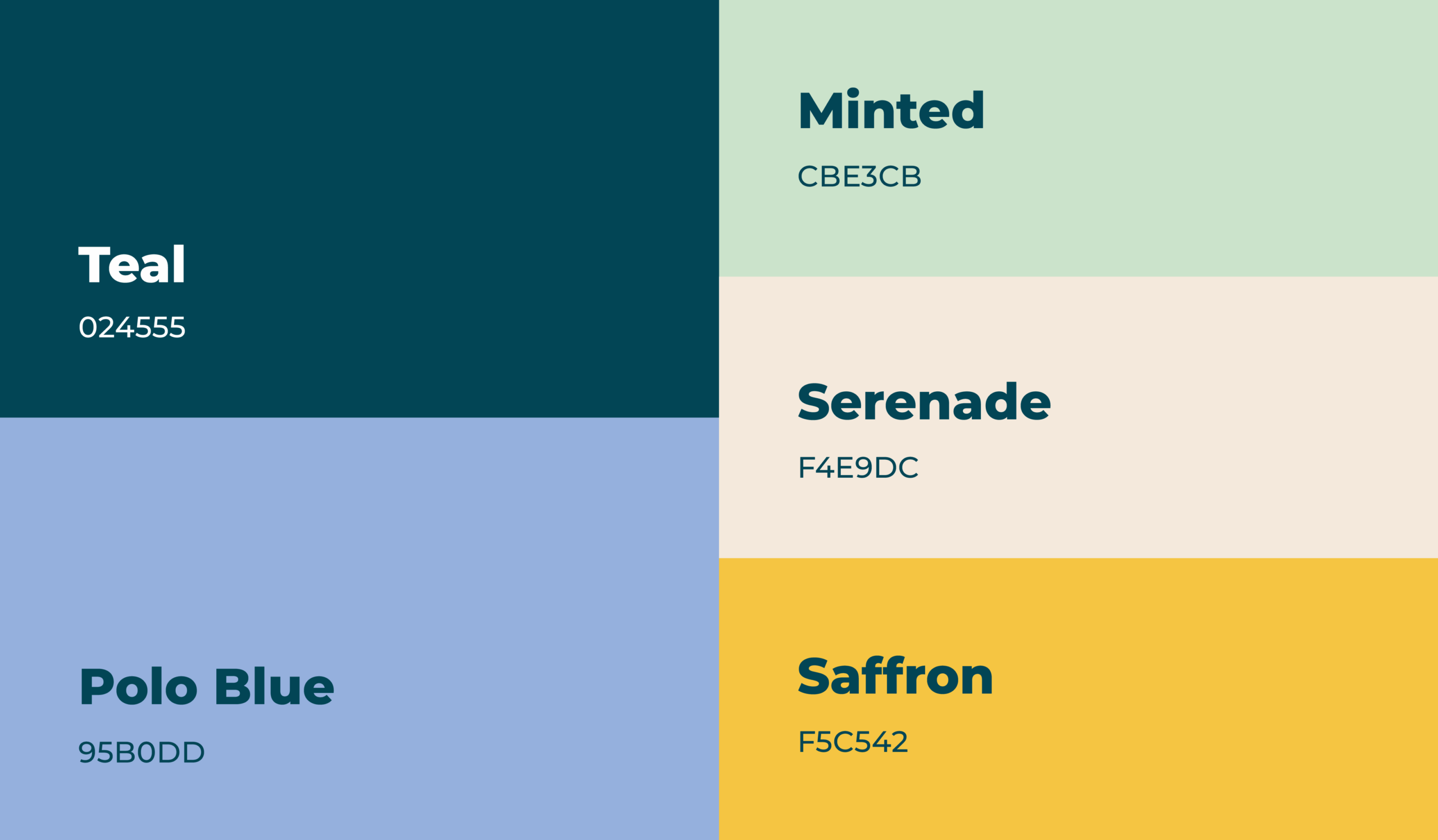
This week’s palette felt grounded, hopeful, and bold—the kind of tones you’d want supporting a mission with real weight.
-
Teal (#024555): Deep like a river, grounding and foundational
-
Polo Blue (#95B033): Smooth and steady, flowing like water
-
Minted (#CBE3CB): A fresh burst—light, calming, and restorative
-
Serenade (#F4E9DC): Soft contrast, like sand or linen
-
Saffron (#F5C542): Liquid sunshine, a bold pop of energy
Together, these shades balance seriousness with optimism. They feel just as at home in a research institute’s report as they do across a campaign calling people to action.
What We Made
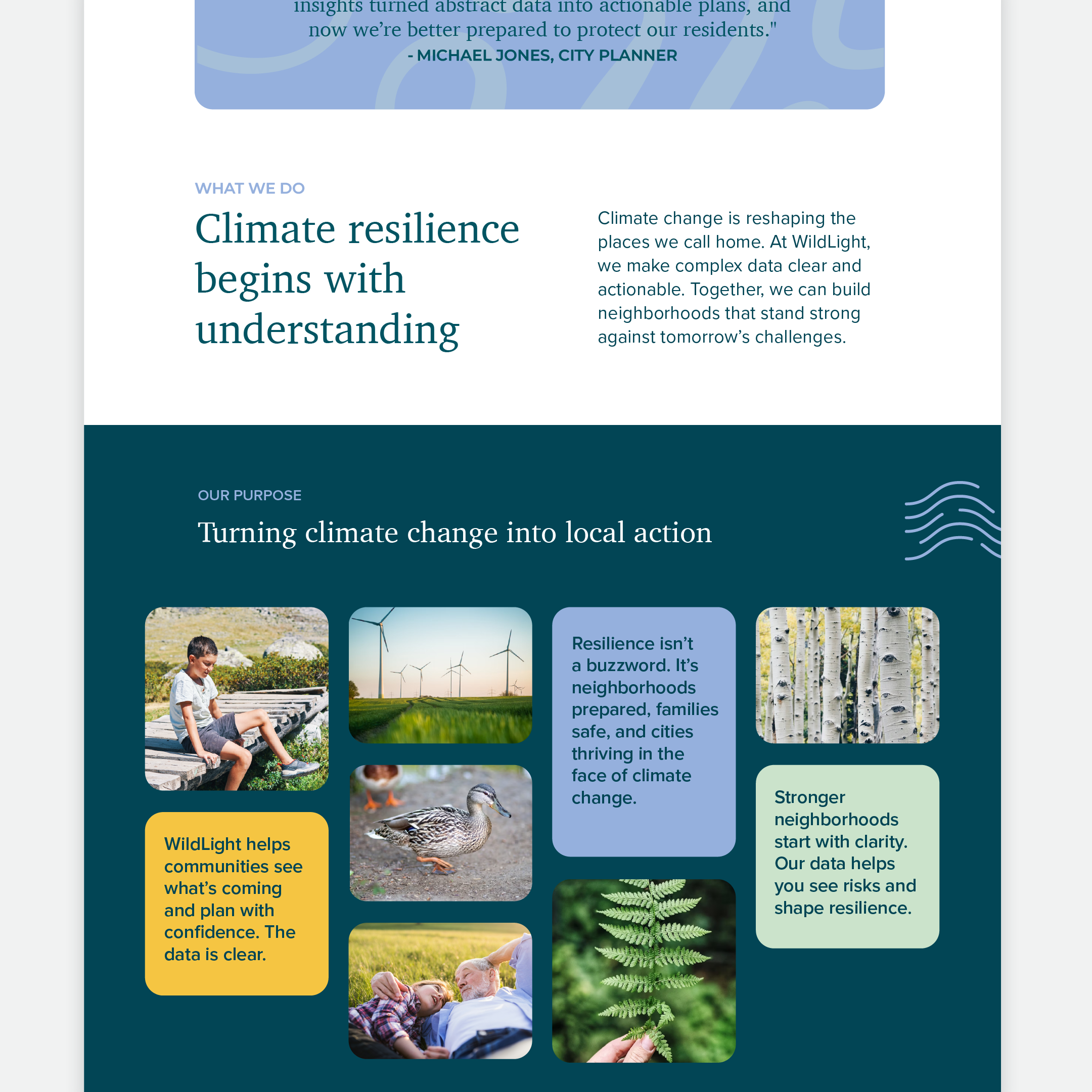
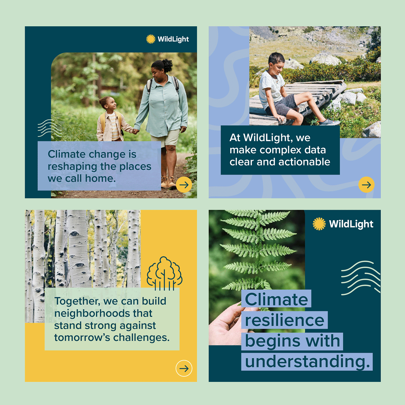
For this round, I imagined WildLight: a think tank that helps communities understand and act on climate resilience.
-
Webpage Layout Sections — Mockups paired dynamic photos of nature and people with bold color blocks. Teal worked especially well against photography, while Serenade softened the edges and Saffron provided moments of bright emphasis.
-
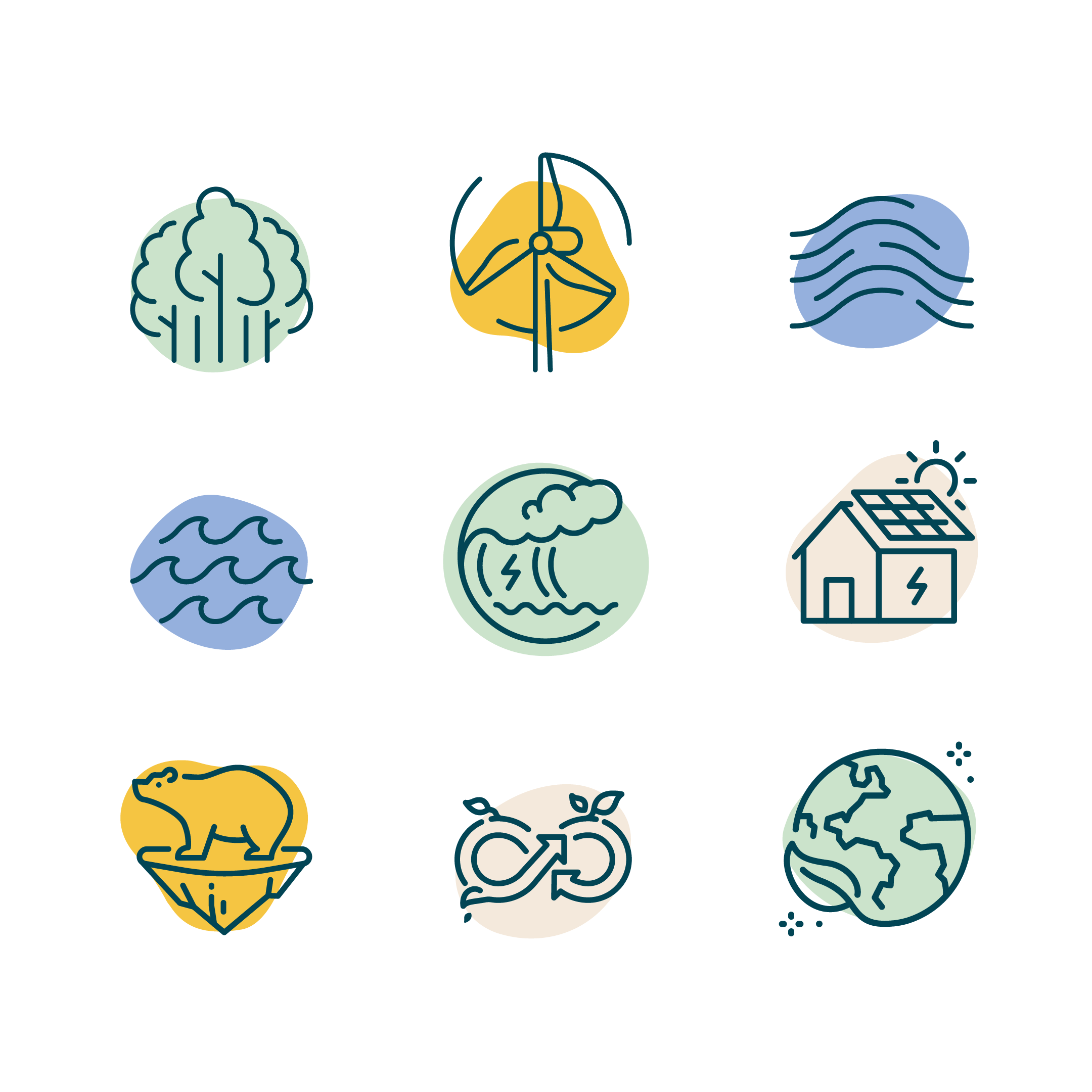
Icon Set — Simple line icons in Teal, placed over organic shapes filled with the supporting palette. This added a free-flowing, approachable feel while keeping the seriousness of the topic intact.
-
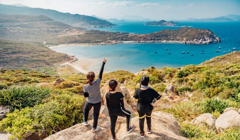
Social Media Templates — Four quick post designs centered on strong messaging (“See the climate risks. Build stronger futures.”). Each paired natural imagery—neighborhoods, families, landscapes—with clean typography, keeping the message front and center.
Tone was everything. Even when the subject matter is dense, the design is approachable, optimistic, and easy to navigate—reminding us that resilience is possible.
What We Noticed
The palette carried beautifully across every touchpoint. Teal provided structure and contrast, Serenade gave space to breathe, and Minted and Polo Blue added freshness. Saffron was the perfect accent, offering energy without overwhelming the group.
And the best part? It worked straight out of the box. No tweaks, no substitutions; just a ready-made system that feels brand-worthy from the start.
For WildLight, the palette gave weight to their voice:
“Climate resilience begins with understanding. Climate change is reshaping the places we call home. At WildLight, we make complex data clear and actionable. Together, we can build neighborhoods that stand strong against tomorrow’s challenges.”
This study showed how design can make climate action approachable—turning something overwhelming into something we can actually do, together.
Other Use Cases
In this lab, we tested the palette on a concept for WildLight, a climate resilience think tank. But it would also feel right at home with:
-
A sustainability startup focused on clean energy or green infrastructure
-
An interior design studio, maybe targeting millennials
-
A local bakery with a signature menu and memorable brand
-
A leadership training consulting company
Want to See More?
Follow along on LinkedIn where I post new palettes weekly, and come back here for the next round of Color Theory Lab, another quick creative experiment exploring how color performs in the wild.

Jess Watson is the CEO & Creative Director of Points North Studio. She's the co-organizer of Baltimore Womxn in Tech, a big believer in Baltimore city, and a pioneer of working remotely while traveling the globe.