Financial brands have a reputation for playing it safe, especially when it comes to color. Think deep navy, conservative gold, maybe a splash of forest green if they’re feeling wild. These palettes communicate stability, trust, and experience, but they can also blend together into a sea of sameness. What if a wealth advisory brand could feel bold, warm, and unexpectedly delightful?
In 2024, I started a weekly color post on LinkedIn where I share new palettes and invite folks to imagine how they might show up in the real world. It’s a creative playground outside of client work—and sometimes, those explorations lead to full-blown brand concepts. This one started with a spicy little hue called Fading Embers and a cool counterpoint in Lilac. From there, Lumora Wealth Advisory was born. Let’s take a look.
The Creative Process
One of the only rules I set for myself in these branding challenges is a time limit, usually no more than 5–6 hours from idea to execution. Side projects have a sneaky way of ballooning if you’re not careful, so this boundary keeps things light, focused, and fun. For this one, I wanted to riff on the quiet confidence of a traditional financial firm… but with a twist.
I find these exercises help me stay nimble and trust my gut, something I also practice in my improv comedy life outside the studio. When you don’t overthink, magic tends to happen. That’s what I love about these experiments: they remind me that first instincts are often the right ones. So with that spirit, let’s meet Lumora.
Meet Lumora
When we imagine the future of financial consulting, we see more than spreadsheets and suits. We see clarity. Calm. Confidence. That’s the space Lumora was created to fill.
The name itself is a blend of light and presence—inspired by words like “illuminate,” “aura,” and “more.” It suggests a brand that leads with clarity and helps clients feel grounded, guided, and empowered. Lumora isn’t about flashy promises or fast wins. It’s about thoughtful strategies, steady progress, and building trust that lasts.
This brand is for a wealth advisory firm that dares to break from tradition—one that leads with intention and shows up with both expertise and warmth. And the identity we created reflects just that.
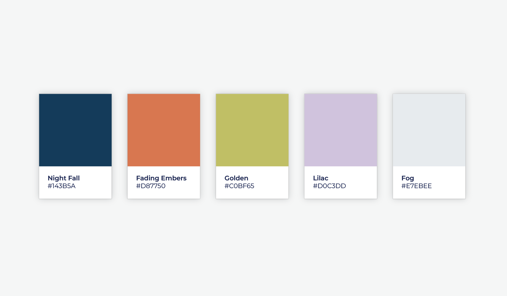
Let’s Talk Color
When it comes to financial brands, blue and gold are the go-to combo, and for good reason. They signal trust, tradition, and professionalism. But what happens when you want to hold onto that trust and stand out from the crowd?
That’s where this palette comes in. By weaving in Lilac and Fading Embers—two colors that don’t typically show up in this space—we injected personality, warmth, and a sense of modernity into Lumora’s identity. The lilac cools things down just enough, while Fading Embers adds a bit of spice and intrigue. Together, they create a brand that’s still grounded in expertise, but with an unexpected delight baked in.
Because at the end of the day, clients don’t just invest in services, they invest in how a brand makes them feel.
From Concept to Logo Mark
The naming and color choices laid the foundation, but now it was time to bring Lumora to life through design. When I sat down to sketch ideas, I knew I wanted something simple yet memorable. Something that felt intentional, balanced, and quietly powerful.
The final logo is built from a single, continuous line that curves into a soft, rounded plus sign. It’s a mark that symbolizes clarity, calm, and forward momentum, without being overly literal. There’s elegance in its restraint and just enough personality in its form to feel approachable. Rendered in our rich Golden hue, it stands strong on both light and dark backgrounds and scales beautifully across applications.
Typography played a big role in shaping Lumora’s voice. For the logo, we used Baskervville, a refined serif with historical depth and contemporary polish. Originally inspired by Baskerville’s 18th-century typefaces and later revived by French designer Jacob in the early 1800s, this version was digitized by ANRT students in 2017. It pairs the warmth of transitional serifs with a modern edge, perfect for a brand that honors tradition but isn’t bound by it.
To support the logo and build out the brand system, we brought in Charter for titles and Source Sans Pro for body copy. Charter, designed by Matthew Carter in the late ’80s, was made for legibility on early low-res printers, and it still shines on screens today. Source Sans Pro complements it with clean, open forms ideal for digital content and long reads.
Together, these type choices round out Lumora’s tone: thoughtful, human, and clear without ever being clinical.

Expanding the Visual Identity
Photography That Feels Human
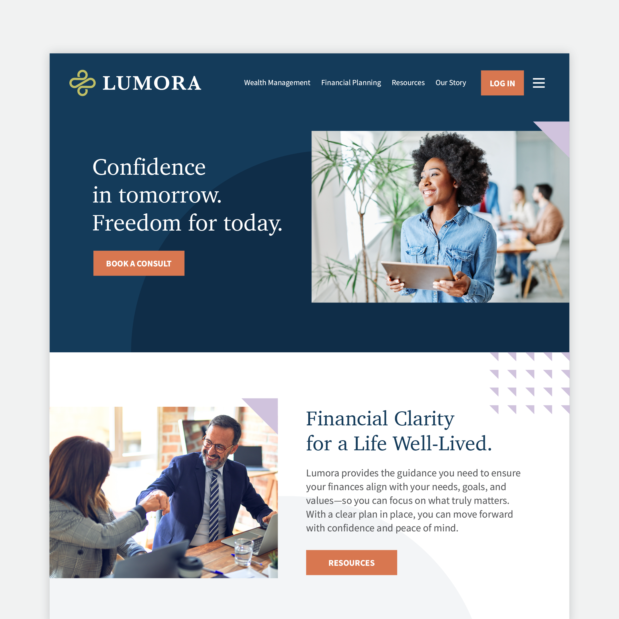
Lumora is all about bringing clarity and confidence to financial decision-making, without the cold, buttoned-up atmosphere many firms default to. So when it came time to select photography, we focused on images that felt professional, but also natural, modern, and welcoming.
We selected photos of business professionals in relaxed, contemporary workspaces with exposed brick, natural light, and open layouts. Their attire is business casual, and more importantly, their expressions and body language feel genuine. No stiff handshakes or forced smiles—just people engaging with their teammates and technology in authentic, everyday moments.
This approach helps position Lumora as a brand that’s approachable and human-first. The photography doesn’t just show what the business does, it reflects how the brand makes people feel: comfortable, seen, and supported.
Thinking about the Website
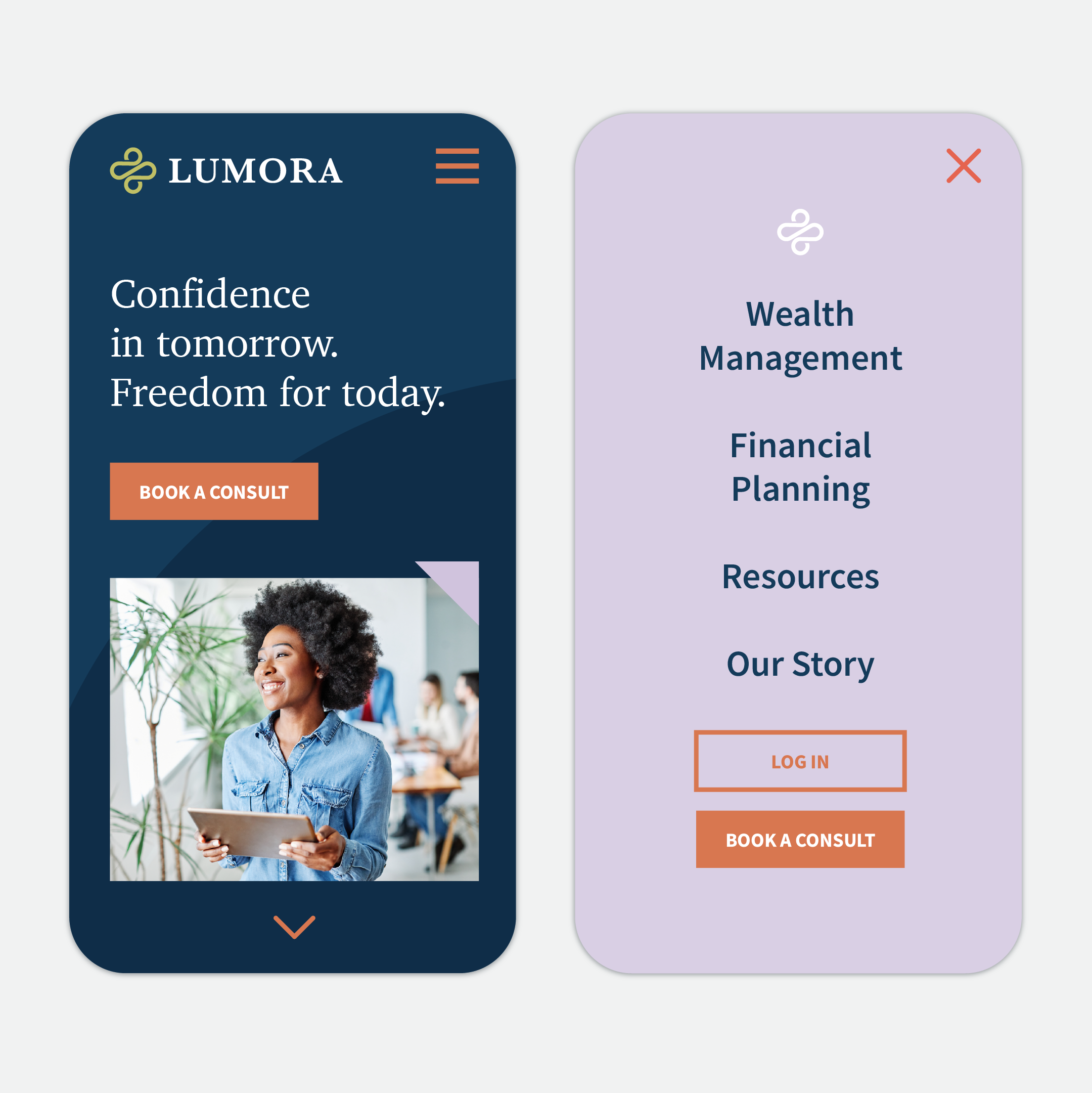
Every time I start one of these brand experiments, I have to resist the urge to go full dark mode with bold splashes of color. And honestly? Sometimes that’s the right move. But for Lumora, I challenged myself to lean into the softer tones in the palette, creating something that feels spacious, intentional, and quietly confident.
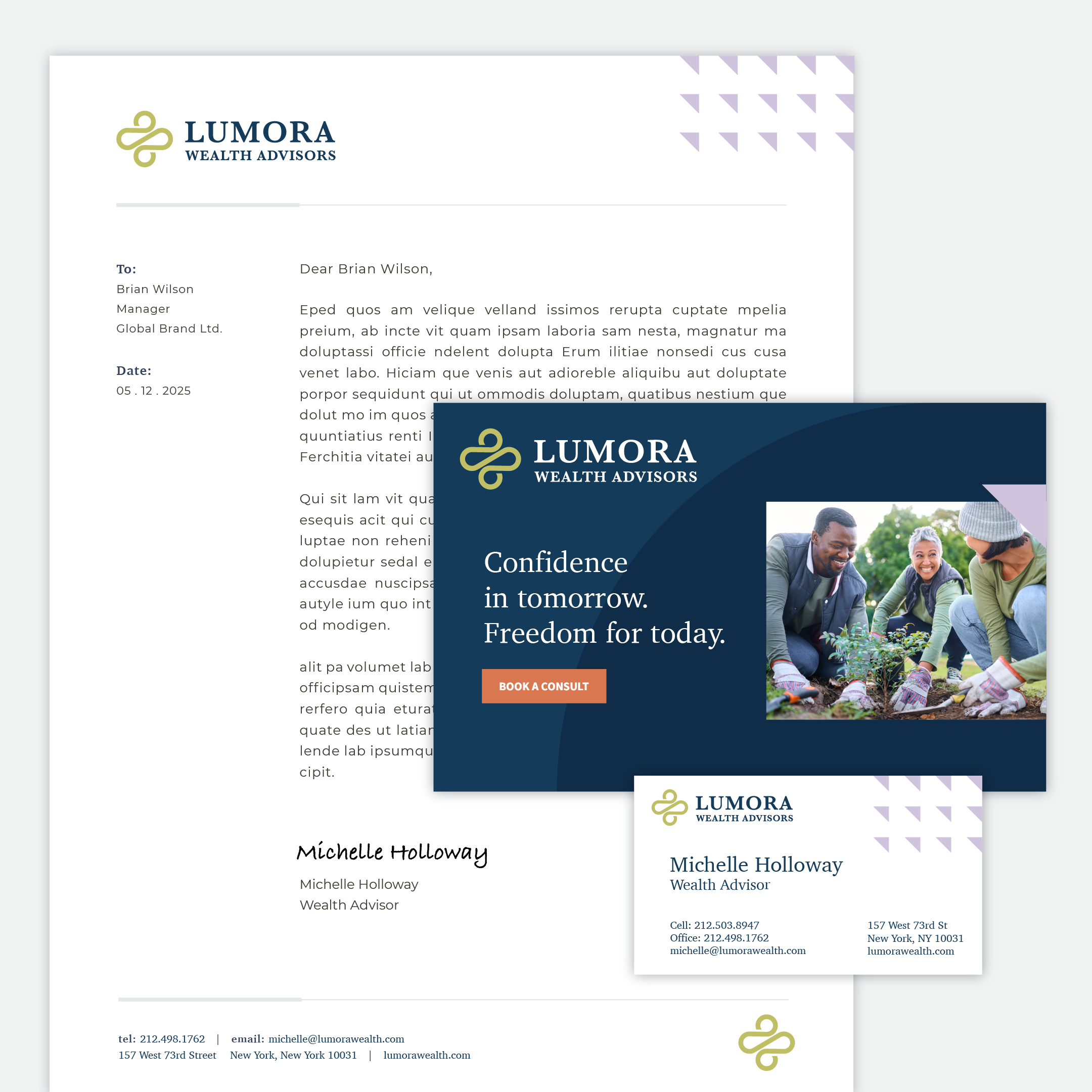
On the website, color isn’t just decoration—it’s used with purpose. Fading Embers, a warm orange, appears only for call-to-action buttons. By reserving it for this one purpose, the color becomes instantly associated with taking action and engaging with the brand.
The header section uses Night Fall, a deep, moody blue that establishes trust and sophistication right away. Lilac accents are woven throughout the site to add warmth and cohesion, while light circular shapes are used sparingly in the background to break up space and create a smooth, flowing experience.
Clear, confident messaging carries the design forward. Phrases like “Confidence in tomorrow. Freedom for today.” and “Financial clarity for a life well-lived.” help visitors quickly understand not just what Lumora does, but how working with them might feel.
Extending the Brand Beyond the Website
To round out the brand system, we designed a business letterhead, business card, and postcard. Each piece feels like it belongs, visually connected through shared colors, typography, and layout choices that reflect the design language of the website.
Consistency across materials isn’t just about looking good. It builds trust, reinforces recognition, and helps a brand feel intentional at every touchpoint. Repeating design elements—like the placement of the logo, the Golden accent color, or the curved background shapes—creates a rhythm that becomes synonymous with Lumora over time.
These materials lay the groundwork for something more. This system could easily grow into a full brand guide, social media templates, pitch decks, and investor kits. Down the line, it could support a digital onboarding experience or branded tools that help clients engage more deeply with Lumora’s services. A well-crafted visual identity doesn’t just reflect where you are—it supports where you’re going.
In Conclusion
If Lumora were a real company, I might be tempted to join the team myself. Thoughtful branding, financial clarity, warm colors, and a quietly confident logo? Yes, please. But for now, it lives in the world of creative exploration—part of an ongoing series where I challenge myself to reimagine what’s possible when strategy and storytelling meet good design.
At Points North, these exercises aren’t just fun—they keep our creative instincts sharp and remind us how powerful branding can be when it’s done with intention. If you’re thinking about refreshing your own brand or bringing a new one to life, we’d love to help.
And if you liked this deep dive, here are a few more design challenges you might enjoy:
- Deep Dive: If We Branded a Consulting Group
- Deep Dive: A Fresh Look for a Boutique Dental Practice
- Deep Dive: If We Designed a Fish Market Brand
- Deep Dive: If We Branded an Improv Comedy Team
Thanks for taking a deep dive with us. Sign up for our monthly newsletter to learn more about what we’re up to. Hey, feel free to also reach out to us about your next creative project.

Jess Watson is the CEO & Creative Director of Points North Studio. She's the co-organizer of Baltimore Womxn in Tech, a big believer in Baltimore city, and a pioneer of working remotely while traveling the globe.