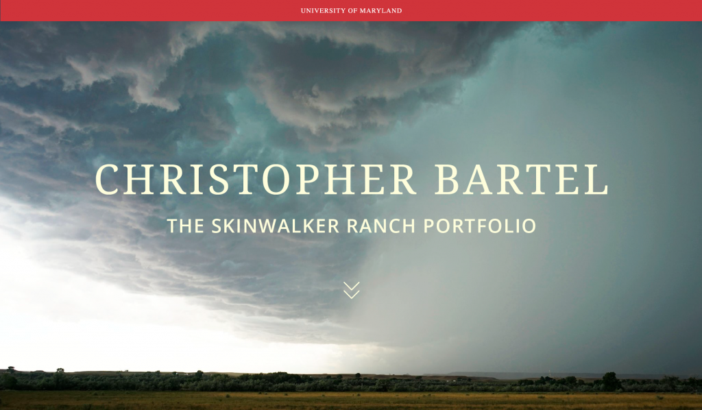
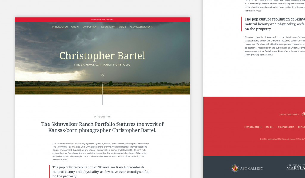
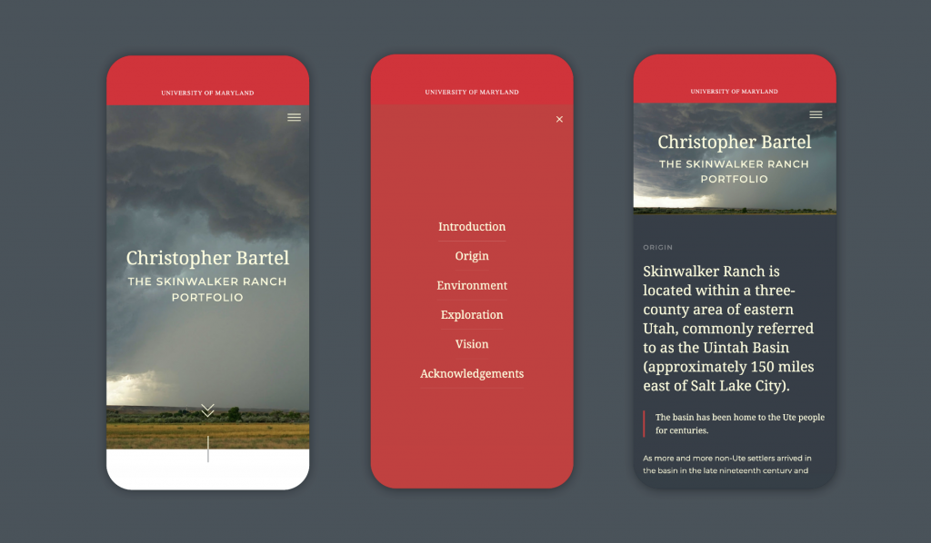
How do you create an art exhibit in a time when museums and other art spaces are closed due to a global pandemic? That’s a question we had to collectively ponder when we were approached by the University of Maryland Art Gallery, to create a virtual home for their upcoming exhibit, The Skinwalker Ranch Portfolio, featuring the photography of Christopher Bartel.
The Challenge of a Lifetime
The University of Maryland Art Gallery is the flagship art museum on the campus of the University of Maryland, College Park. The usual way to see a featured exhibit is to open the door and walk inside. However, the pandemic took away the opportunity for in-person exhibits. Art spaces around the world were faced with an unexpected challenge. Do they put their plans on hold or coming up with an alternative solution? We’re so glad that the University of Maryland chose the latter.
We connected with Taras Matla, Associate Director of the University of Maryland Art Gallery. At the Art Gallery, he oversees its day-to-day operation and a permanent collection of over 4,500 works of art. During Matla’s tenure, the gallery’s permanent collection has doubled in size. He has also curated and coordinated several key exhibitions at the Art Gallery, including The Skinwalker Ranch Portfolio. Taras explained the dilemma of wanting to find a way to lead visitors through the exhibit, so they understand the story and what makes these photos so phenomenal.
Understanding The Skinwalker Ranch Portfolio
When I first saw the photos, I thought they were both beautiful and surreal. They have an unworldly quality to them. At that time I didn’t know much about Skinwalker Ranch. Before we start to design for any project, we research what we’re getting into. Skinwalker Ranch, is a property located on approximately 512 acres southeast of Ballard, Utah. In addition to its vastness, it is reputed to be the site of paranormal activities. Its name is taken from the skin-walker of Navajo legend concerning vengeful shaman.(1) Recently, The ranch has claimed the spotlight in the History Channel’s series, The Secrets of Skinwalker Ranch. However, this wasn’t an exhibit about paranormal speculation.
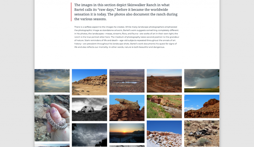
The pop-culture reputation of Skinwalker Ranch precedes its natural beauty and physicality, as few have ever actually set foot on the property.(2) This exhibition features eighty works by Christopher Bartel, a self-taught photographer. Bartel’s photography picks up where icons like William Henry Jackson, Carleton Watkins, and Ansel Adams left off. The work operates as an homage to the time-honored tradition of documenting the American West. In addition, it offers a fresh outlook on how climate, rural life, ecology, and tribal culture interact with one another in the current era.(3)
Our Early Concepts
Based on the way Malta envisioned breaking up the exhibit, our first idea was to have a single-page scroll. We were going to utilize horizontal scrolling and styled galleries to showcase the photos. This plan allows readers to read the content they wanted, and ultimately dive into the exhibit by selecting the photo that first captures them. We thought about the different ways someone might experience the exhibit:
- User one: Wants to read the exhibit through and through. This person will start at the beginning and then follow the story in chronological order.
- User two: Wants to skim the copy. This is why callouts and quotes in larger texts are important. They’ll skim the copy and dive into the photos.
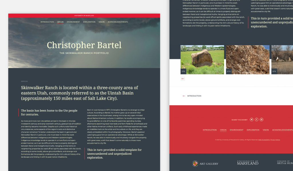
- User three: Will read some and view some photos. But ultimately, they want to jump around. So we need easy ways to navigate the different sections. A main menu in the header and footer, along with back and forth arrows at the bottom of each section.
- User four: This person does not read. They are here for the photos. For this reason, the photos in each section need to be grouped together and easy to navigate through. We need to make it easy for someone to browse the photos. You can click into any photo to see it larger and read the caption.
Our Solution
One of the great things about doing an art exhibit website, is that in many circumstances the art speaks for itself. Our goal, as creatives, is to not have our design compete with or overshadow the art. The use of minimalist layout and design elements helps with that. We were also intentional about using neutral colors, and having background colors break up sections. Additionally, the University of Maryland red made for an excellent accent color.
The only problem with a long-form single-page website, is that you have to be mindful about copy. We had no desire to have visitors to the exhibit scroll down to infinity and beyond. Partway through the project, we noticed the copy was going to be twice as long as we planned for. In regrouping, we were able to turn the exhibit into a full website, without losing the galleries and styling of each section. Take a look for yourself, at The Skinwalker Ranch Portfolio exhibit by the University of Maryland Art Gallery. Thank you to the University of Maryland Art Gallery for trusting us with this project.
–
(1) Skinwalker Ranch, Wikipedia, https://en.wikipedia.org/wiki/Skinwalker_Ranch
(2) The Skinwalker Ranch Portfolio, https://www.skinwalkerranchportfolio.org
(3) University of Maryland Art Gallery website – https://www.artgallery.umd.edu/
