Contrary to popular belief, writing web content is very different from writing for a printed report or publication. For many web viewers, their eyes tend to glaze over when faced with reading static content in paragraph form. Additionally, you’re also likely competing with a browser window that has multiple tabs open. How do you capture their attention? It is now the responsibility of the author to not just have interesting content, but to also craft that content so that it’s easy to digest. Here are some tips to help you format your copy for digital consumption.
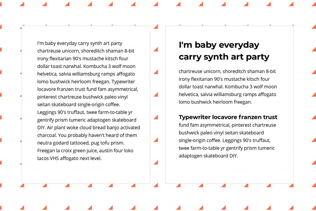
Tip 1: Use sub-headlines to break up your copy.
So, a succession of paragraphs in the same text height are difficult for the eyes to read. This is first due to the medium in which we’re reading, which is often through a computer screen. And secondly, because the copy tends to blur together when a viewer is scrolling. Remember, your goal as a writer of web content is to direct a viewer where you want them to pause and linger. You can do this by creating visual breaks with the use of sub-headlines. For the person reading the full pieces from start to finish, sub-headlines provide a natural understanding of the content that is yet to come. For the person who is skimming your content, sub-headlines help them to zero in on the parts that will be most relevant to them, helping them to easily navigate the article to get to the part they need.
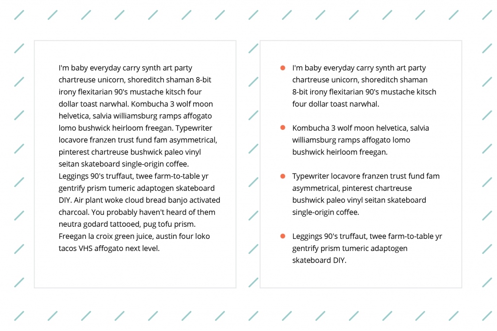
Tip 2: Bullet lists are your friend.
Yes, there is nothing wrong with a good ol’ fashion bullet list to help break up information. This visually orients the reader, and also organizes your content spatially so that it has a more natural flow. You can bold text within a bullet list to call out a theme or the main point of each bullet. Typically, the text for each bullet is just a couple of sentences long. If you are turning bullet points into whole paragraphs, you’re doing it wrong.
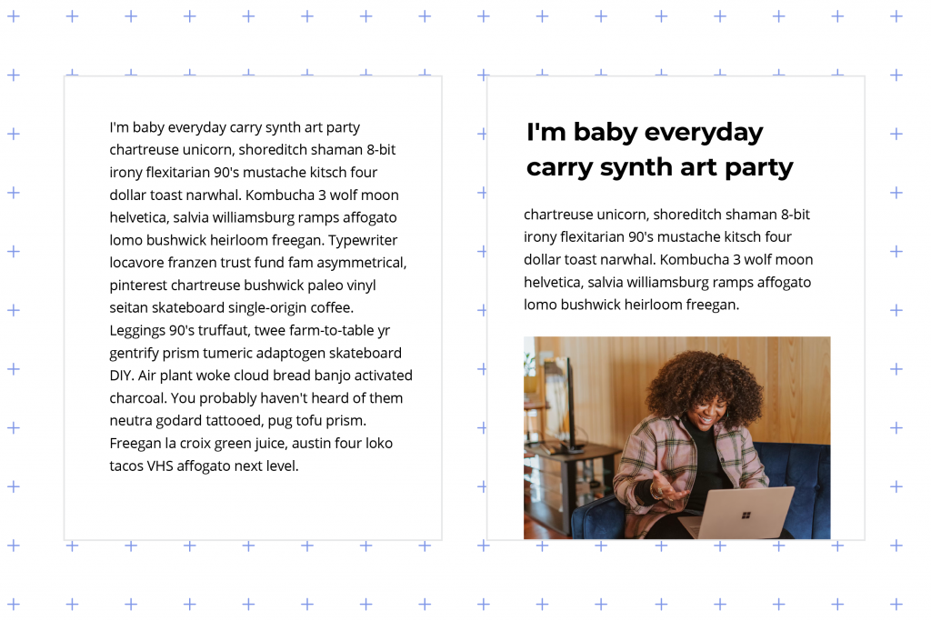
Tip 3: Let’s get visual
One of the best ways to break up your content and draw a reader in is with visuals. A couple of stock photos cleverly placed between sections of text works to create a nice flow to your article. If you don’t have the budget to purchase stock photos, you can use a free resource like Unsplash to find quality photos at no cost to you. Additional visual options to consider for breaking up content include video and infographics. Adding visual pieces may make your article feel longer. However, the value it adds is allowing a reader to successfully make it through your piece.
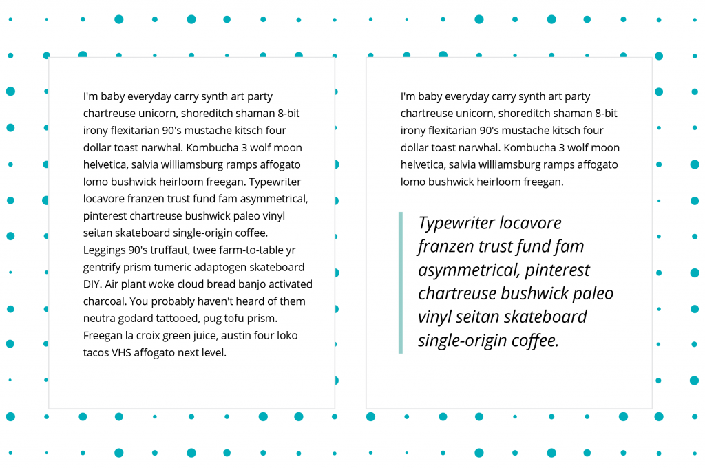
Tip 4: Pull that quote out
A pull quote can be defined as a brief, attention-catching quotation, typically in a distinctive typeface, taken from the main text of an article and used as a subheading or graphic feature. Pull quotes are another style of treatment that serves two purposes for your content. First, it adds a natural break in your content, which helps your reader to orient themselves. Second, a pull quote is a great way to highlight an important fact or statement in your article. In this way it serves as another way to invite the reader to go deeper.
In conclusion, a successful article or essay often has a combination of 2 or more of the tips mentioned above. Also, all filler content featured in the samples came from Hipsum (the hipster version of lorem ipsum).


