“So much of your life gets better as you age,” Jane Fonda says.
“We become less stressed, we become kinder to ourselves, and braver.”
That quote from her CBS Sunday Morning segment on aging well stuck with me—and honestly, it lit a spark. According to research, people with more positive beliefs about aging live 7.5 years longer than those who equate age with disease and decline. And one of the simplest ways to live longer? Start with a good attitude.
The narrative is shifting.
Right now on the streaming platform Max, And Just Like That… is exploring aging through the lens of women who’ve lived, and are still living, full, messy, beautiful lives. Yes, there are physical changes. But there’s also transformation, freedom, and reinvention.
On Netflix, Michelle Obama’s production company released The Later Daters, a dating show featuring singles aged 56 to 71 navigating love, attraction, and connection in midlife. The show is joyful, complex, honest—and frankly, overdue.
So why are we still treating the phrase Senior Moment like it’s something bad?
Let’s be real—young people forget stuff all the time (seriously, where are my car keys?). But we don’t call that a junior moment, do we?
What if we rebranded Senior Moments into something powerful?
Something that stands for boldness, community, and fun?
Okay, Jane. Let’s Build Something.
Community is one of the biggest factors in aging well—and for many, art classes are an easy, joyful way to start getting connected. As someone who’s a caretaker for my mom, I’m always looking for ways to help her stay active, involved, and inspired. So this one hits close to home. If I could wave a magic wand and make a platform appear that helped older adults discover classes, trips, and gatherings near them, I would. Actually… maybe I just did.
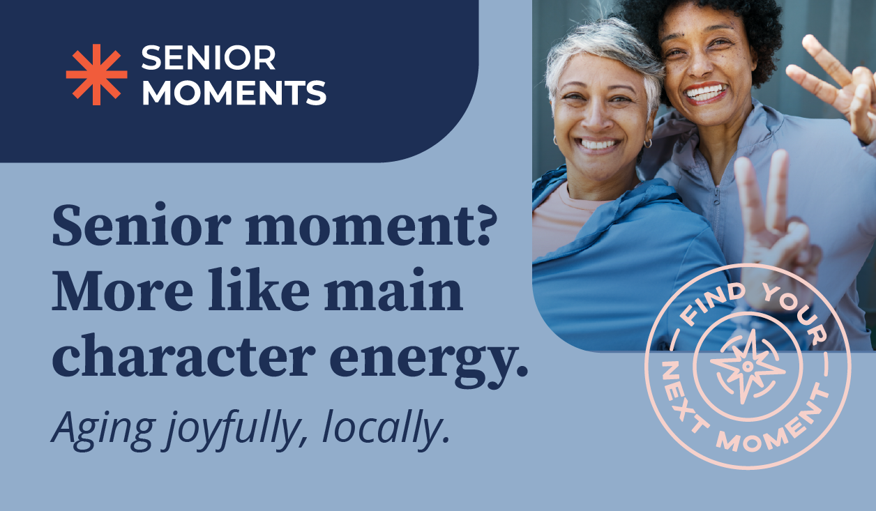
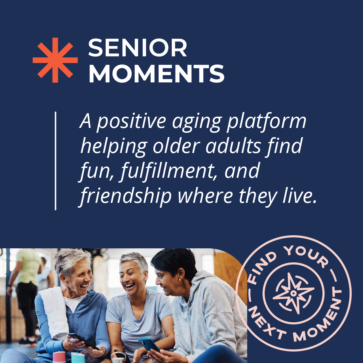
Welcome to Senior Moments:
A positive aging platform helping older adults find fun, fulfillment, and friendship where they live.
The Creative Process (aka: How I Dreamed This in 6 Hours)
One of the few rules I set for myself in creative side projects like this is a time limit, usually no more than 5–6 hours from idea to execution. Side projects have a sneaky way of ballooning if you’re not careful, and this boundary keeps things light, focused, and fun.
For this one, I wanted to riff on the quiet confidence of a traditional financial firm… but with a twist. Something polished but a little playful. Something familiar, but reimagined. These quick projects help me stay nimble and trust my gut—just like I do in improv comedy outside the studio. And when you don’t overthink? That’s when the magic happens.
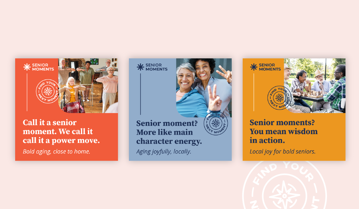
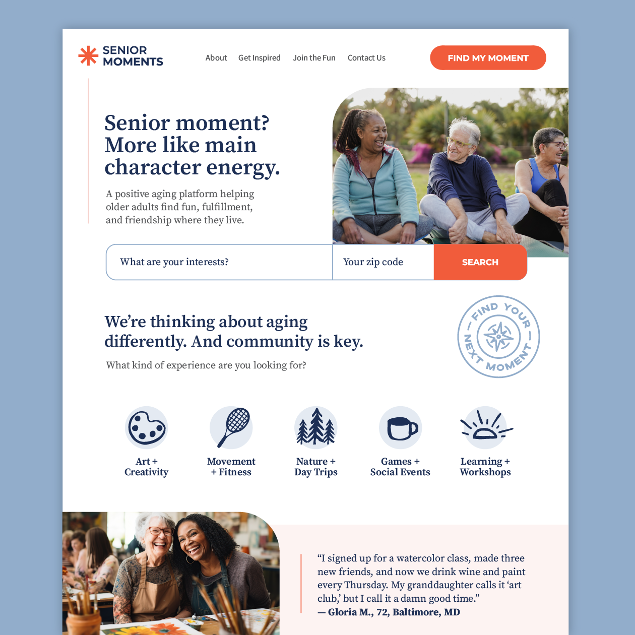
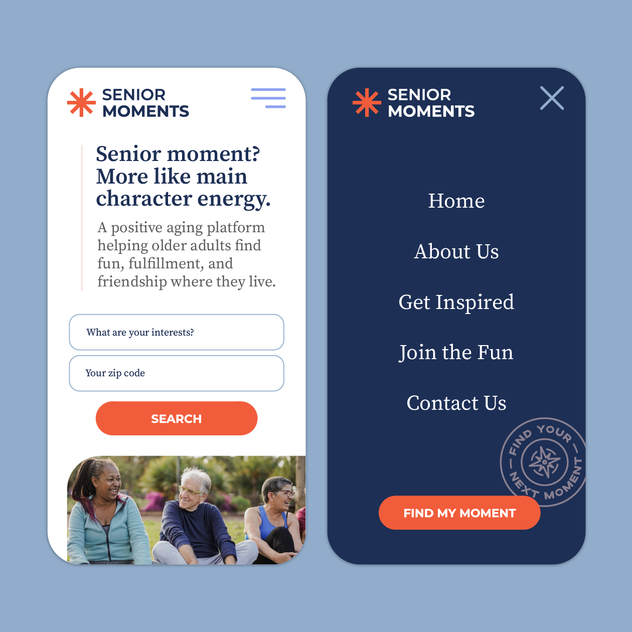
Senior Moments? More Like Main Character Energy.
In thinking about the actual user experience, it’s clear: this isn’t just for older adults, it’s also for the Gen X or Millennial child of an aging parent, the one doing all the research. That insight gave me permission to build in a bit of sass—not to be flippant, but to bring joy and humor into the mix.
From that lens, we imagined a platform that makes it easy to find events, meetups, and classes based on interests and zip code. Bonus: it could include a text-based AI assistant to nudge people toward connection with personalized weekly suggestions, reminders to stretch, or even affirmations to start the day.
Aging well is about mindset. And Senior Moments is here to help flip the script.
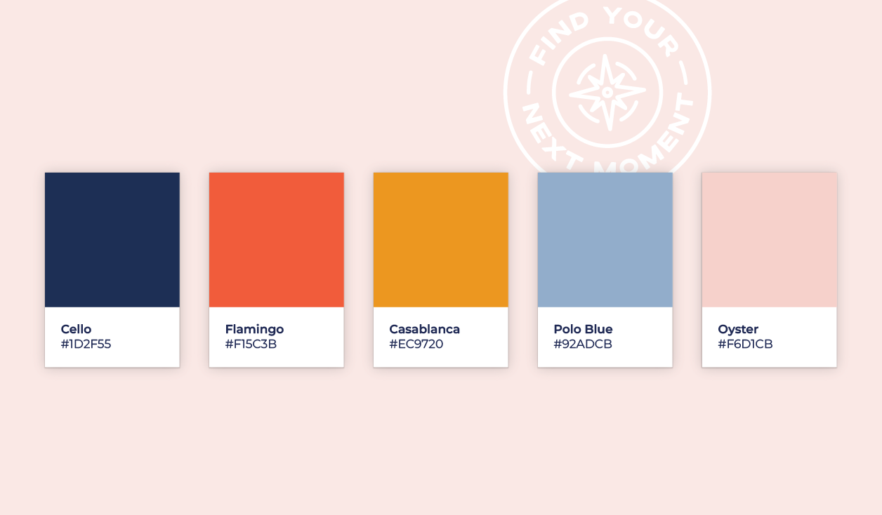
Let’s Talk About Color
If you follow me on LinkedIn, you know I love a good color palette. For this one, I pulled from my weekly color series to craft something bold, friendly, and full of energy:
- Cello – a deep navy to ground the brand
- Flamingo – a punchy warm red for calls to action and sparks of joy
- Polo Blue – a calm contrast to Cello
- Casablanca – a fresh citrusy orange that pops
- Oyster – a soft neutral for backgrounds and spacing
This palette had to feel vibrant and energizing—just like the platform itself.
From Concept to Logo
Once the name and colors were in place, I turned my attention to the logo. I sketched ideas that embodied light and joy, even explored a hot air balloon for a bit, but ultimately landed on a spark, a symbol of inspiration, in the bold Flamingo brand color.
For typography, we paired:
- Source Sans (with a heavier weight on “Moments” for balance and emphasis)
- Source Serif for titles, grounding the brand in tradition
- Open Sans for body copy, a clean, humanist touch
Together, these fonts reflect the tone of the brand: intentional, warm, and confidently unbothered.
Expanding the Visual Identity
Authenticity was key when selecting imagery. We used photos of real seniors—laughing, creating, hiking, stretching, playing—representing a wide range of ethnicities, body types, and abilities. As someone who has to call ahead to check on handicap access for my mom, it was important to signal that everyone belongs here visually.
And yes—no AI-generated models. We’re going for human, not hyper-polished.
Thinking About the Website
The digital experience needed to feel just as intentional and energizing as the brand itself, something that speaks to both older adults and the adult children who might be helping them navigate it. This imagined platform needs to do two things:
- Inspire joy and curiosity (through bold statements like “Senior Moment? More like main character energy.”)
- Make discovery easy. Whether someone types in their interests and zip code or browses by category (arts, movement, nature, social events, or learning), it’s all about meeting people where they are.
I imagine future iterations could include:
- Research on community and aging
- A chat feature or SMS concierge powered by AI
- Weekly activity suggestions and encouraging nudges
Every interaction, digital or IRL, would reflect the same personality: bold, inclusive, and joyful.
In Conclusion
Jane Fonda, if you’re reading this: hire us to build this for real. The world needs it.
At Points North, these creative exercises aren’t just fun. They keep us sharp, curious, and connected to why we do what we do. They’re also a reminder of just how powerful branding can be when it’s rooted in intention.
If you’re thinking about refreshing your own brand, or dreaming up something bold and new, we’d love to help.
And if you liked this design deep dive, here are a few more creative explorations you might enjoy:
- Deep Dive: If We Branded a Wealth Advisory Group
- Deep Dive: If We Branded a Consulting Group
- Deep Dive: A Fresh Look for a Boutique Dental Practice
- Deep Dive: If We Designed a Fish Market Brand
Resources
Jane Fonda with a secret of aging well – https://www.youtube.com/watch?v=KQXAJRY6XYs
Thank You, And Just Like That… For Rebuking Middle-Age Hair Clichés – https://www.allure.com/story/and-just-like-that-middle-age-hairstyles
How Michelle Obama’s ‘Later Daters’ Reinvented a Reality Staple: “We’re Telling Everyone’s Story” – https://www.hollywoodreporter.com/tv/tv-news/why-michelle-obama-later-daters-1236091099/

Jess Watson is the CEO & Creative Director of Points North Studio. She's the co-organizer of Baltimore Womxn in Tech, a big believer in Baltimore city, and a pioneer of working remotely while traveling the globe.