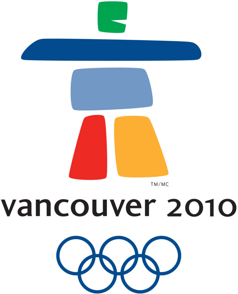
We are always looking for exceptional design and we love the Vancouver 2010 Winter Olympics logo. This article below was originally featured on the Canadian Press website. We’re sharing this with you to give you the inside scoop behind the design.
The 2010 Winter Olympics will feature a unique design of an inukshuk, a traditional stone sculpture used by Canada’s Inuit people, as its official logo.
The winning logo, called Ilanaaq (el la nawk), was unveiled Saturday in Vancouver and was designed by local graphic designers Elena Rivera MacGregor and Gonzalo Alatorre.
Their emblem was selected by a nine-member panel and beat out over 1,600 other submissions.
The logo boasts five stone-like formations in green, two in blue, and one in red and yellow. Two pillars serve as the legs in support of the body, a horizontal shape acts as the arm and an eagle is where the head would normally be.
The form stands over the words “Vancouver 2010” and the five Olympic rings.
The different colours represent different regions of the country: the green and blues symbolize coastal forests, mountain ranges and islands. The red represents Canada’s Maple Leaf and the yellow depicts the brilliant sunrises.
“There were only so many things that could represent the entire country,” said Rivera MacGregor. “We researched it and we concluded the inukshuk was in fact one character that could pretty much tell the whole story.
“The value of the style and components of it, the colours, that’s what took it over the top.”
Rivera MacGregor said her team used an inukshuk in Vancouver’s Stanley Park as their inspiration.
Even though the Vancouver Olympics are five years away, you can expect to see the logo on television, on signs, on clothes, and on global advertisements in the lead up to the 2010 Olympics.
“This is an emblem when you see it once you never forget it,” said John Furlong, chief executive officer for the Vancouver 2010 Organizing Committee. “That’s remarkable and important.”
The new logo also impressed Jacques Rogge, president of the International Olympic Committee.
“I loved it immediately,” Rogge said in a videotaped interview shown to the crowd. “I smiled when I saw it.”
“It reminds me of a hockey goalie.”
Paul Okalik, premier of the territory of Nunavut, was pleased by the choice of an inukshuk as the Olympic symbol.
“We don’t have any Maple Leafs from where I come from,” said Okalik. “This is very special.
“It shows a strength. Our inukshuk has been around a very long time. To be shown off to the rest of the world is very special for us.”


