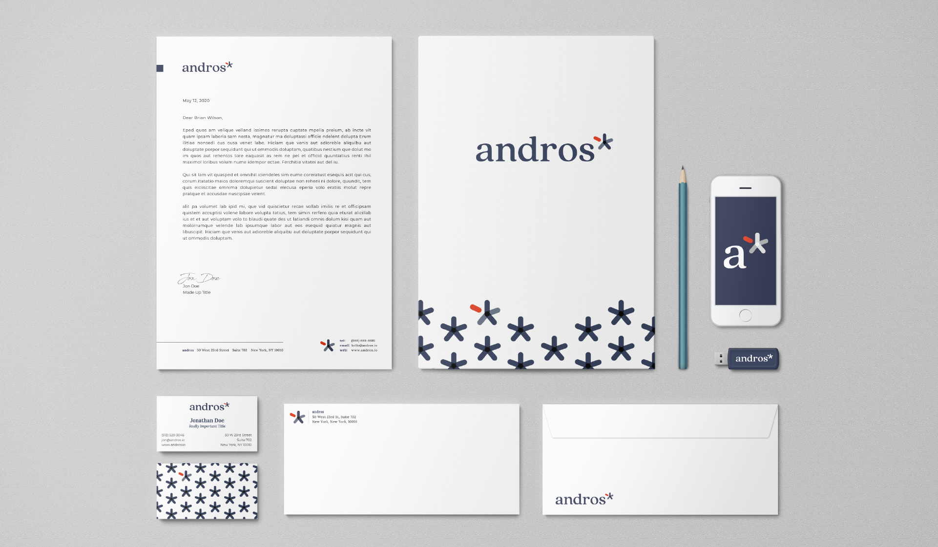
This healthcare tech company was known in the industry as CredSimple, but over the years they found themselves becoming something more. They were seeking a company name and brand that embodied what they were growing into. Let's go north.

If you’ve been in the game a while, your business is bound to have a lot of moving parts. And those moving parts, well, they also have moving parts. Your logo and branding might have started as one concept, but over the years (and over the different iterations, additions, mergers, and variations), it’s something totally different. You might get to a point where you’re questioning if it still captures the essence of your company, and if it still resonates with your audience.
This was the dilemma for andros (formally known as CredSimple). What started in 1998 had evolved over the last two decades, and they were in need of a rebranding that would bring all these moving parts together. This is where Points North Studio thrives.
Through a collaborative effort involving in-depth discovery along with diligent exploration and research, Points North was able to guide company leadership through the naming process and create a brand that encapsulated each and everything that andros stood for.
Andros is the third-largest fringing barrier reef and living organism in the world. The intersectionality and interconnectedness of coral is symbolic of the work they were doing with provider networks – these ecosystems are diverse, sustain life, and rely on many species and colonies of individual polyps to exist.
From that idea, a rebranding was born. Along with thoughtful style guidelines and intentional color palettes, Points North provided andros with everything needed to confidently express and showcase their evolution as a company and their prominence in the industry.